

Digitizing Curved Text for Caps: Why Straight Letters Don't Just Bend 2026
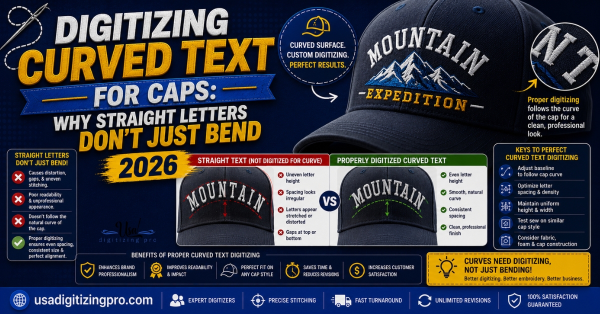
Text that reads perfectly straight on a screen doesn’t automatically curve cleanly once it’s stitched across a cap front. Digitizing curved text for caps is a deliberate rebuild, not a bend filter applied to flat lettering. Each letter’s angle, spacing, and stitch direction has to be recalculated individually to follow the cap’s arc, particularly around the keyhole area above the closure strap where the curve is tightest. Here’s what actually changes when text moves from a flat mockup to a curved cap front.
Quick Answer at a Glance
Why Curved Text Isn’t Just Bent Flat Text
A digitizer building curved cap lettering doesn’t take a straight line of text and warp it like a graphic design filter would. Each letter gets digitized individually with its own angle set relative to its position on the arc, so the letter itself doesn’t distort even though the overall word follows a curve. Letters near the center of the arc sit closer to vertical, while letters toward the outer edges angle more sharply to stay aligned with the curve’s tangent at that point. Skipping this letter-by-letter angle adjustment is what produces text that looks warped or uneven once stitched, even if it looked fine as a bent path in design software.
Why the Keyhole Area Is the Hardest Part of a Cap to Digitize Text On
Structured caps have a seam and closure strap at the back, and the curve directly above that area, often called the keyhole, is tighter than anywhere else on the cap front. Text that needs to wrap through or near this zone needs extra angle adjustment and often a slight size reduction to avoid letters crowding or overlapping as the curve tightens. This is one of the more common trouble spots in cap lettering, and it’s worth flagging early if your design’s text needs to sit anywhere near that area. For more on how cap structure affects digitizing decisions generally, the cap digitizing services overview covers the broader set of cap-specific considerations beyond lettering alone.
Stitch Type and Underlay for Curved Text
Satin Stitch as the Standard Choice
Nearly all cap lettering uses satin stitch, since it produces the clean, slightly glossy, well-defined edge that reads clearly at typical cap-front sizes. Fill stitching is occasionally used for very large block letters, but for standard cap text, satin is close to universal.
Underlay for Small and Curved Letterforms
Center-run underlay, with a short stitch length around 1mm, is standard for cap text, particularly on smaller letterforms where a wider underlay type would show through or add unwanted bulk. Getting this underlay length right matters more on curved text than on straight lettering, since the curve adds extra stress on each letter’s shape during stitching.
Why Stitching Direction Changes on Curved Cap Text
Most cap designs stitch from the center of the design outward toward each edge, rather than running straight across from one side to the other. This center-out approach keeps tension balanced across the curve and reduces the fabric shifting that can occur if the machine works consistently in one direction across an uneven, curved surface. For curved text specifically, this also helps keep letter spacing consistent from the center of the word outward, rather than letting small errors compound across the full width of a longer word.
Why Letter Size and Font Choice Matter More on a Curve
Fine or heavily decorative fonts that read cleanly in a flat mockup often lose definition once digitized onto a curve, since the curve itself adds distortion that fine linework can’t absorb the way bold letterforms can. Text below about 6mm in cap height is at particular risk on a tight curve, where letters can bridge together or lose their shape entirely. A digitizer will often recommend either a bolder font or a slightly larger text size specifically because the design is curving, not because the flat version had any problem at all.
What Pushes the Price Up for Curved Cap Text
What Happens If Curved Text Isn’t Digitized Letter by Letter
Here’s the failure mode most buyers don’t expect. A design built by simply bending a flat text path, rather than rebuilding each letter’s angle individually, tends to produce letters that lean unevenly, crowd together on the tighter part of the curve, or gap awkwardly on the wider part. This isn’t a stitching problem at the machine. It’s a digitizing shortcut that shows up the moment thread actually follows the file’s instructions on a curved surface instead of a flat screen.
Ordering Checklist for Curved Cap Text
- Confirm the exact wording and whether any part of it sits near the keyhole area.
- Choose a bold, simple font over a fine or script style if the design allows it.
- Keep letter height at 6mm or above where possible for reliable curve legibility.
- Ask your digitizer to flag any letters that may need simplification once the curve is applied.
- Request a physical sample before a full production run, since curved text problems rarely show up in a screen preview.
A Real Order, Broken Down
A fishing charter company in Florida ordered a wraparound wordmark for structured trucker caps, with the business name curving most of the way around the cap front, including a short section near the keyhole. The initial digitizing came back with the last two letters near the keyhole crowding together, since the curve tightened faster than the original letter spacing accounted for.
The digitizer rebuilt the final three letters with tighter individual kerning and a slightly reduced height specifically for that section, while keeping the rest of the wordmark at its original size. The revised sample read cleanly across the full curve, with no visible size difference noticeable to a casual viewer despite the adjustment.
Who Builds These Files
USA Digitizing Pro has digitized curved cap lettering from its Texas studio since 2015, building each letter’s angle individually rather than bending a flat text path. Standard turnaround runs 2 to 4 hours, with pricing starting at $15 for designs under 5 inches. Every file carries a money-back quality guarantee.
Frequently Asked Questions
Most can, but bold, simple fonts hold up more reliably on a tight curve than fine or heavily decorative script styles. A digitizer will typically flag fonts that risk losing definition once the curve is applied.
This usually happens when letters aren’t individually angled to the curve, causing crowding on the tighter part of the arc and gapping on the wider part. Rebuilding the letter spacing and angles for that specific section resolves it.
It’s the curved area above the closure strap at the back of a structured cap, where the curve is tightest. Text passing through or near this zone often needs extra angle adjustment and sometimes a slight size reduction.
It can, particularly for longer wordmarks or text near the tightest part of the curve, since each letter needs individual angle calculation rather than a single straight stitch path.
Around 6mm in cap height is a reasonable floor for reliable legibility on a curve. Below that, satin stitching struggles to hold distinct letterforms, especially where the curve is tightest.
Yes. Center-out stitching, working from the middle of the design toward each edge, helps keep tension and spacing balanced across the curve, reducing the risk of letters drifting unevenly by the time the machine reaches the far edge.
A digital preview gives a general sense, but curve-specific issues like letter crowding near a tight arc often only become clear on a physical stitched sample. Requesting a sample before full production is the more reliable check.
Curves add visual and stitching distortion that flat placements don’t have. A digitizer recommending a larger size is usually accounting for that distortion so the finished letters stay legible rather than blurring together on the curve.
Not dramatically, though curved letterforms are often smaller and more tightly spaced, which makes precise, short-stitch-length underlay more important to avoid it showing through the finished satin.
Yes. It’s common to curve a wordmark around the upper cap front while keeping a separate icon or shape straight and centered, with both elements digitized to work together within the same file.
Getting Curved Lettering Right the First Time
Digitizing curved text for caps means treating each letter as its own decision: its angle, its spacing, and how it holds up specifically where the cap curves tightest. Bending flat text and calling it done is the shortcut that produces uneven, crowded lettering. USA Digitizing Pro builds every curved letterform individually, starting at $15 for designs under 5 inches, with a 2 to 4 hour turnaround.
Follow Us

RELATED BLOGS
The Art Hidden Behind Embroidery Digitizing 2026
Published September 21, 2026 | By USA Digitizing Pro Team Two stitched logos can both be technically correct and one still looks.
Stitching Identity With Hat Machine Embroidery: A Programme.
Published September 11, 2026 | By USA Digitizing Pro Team A branded cap does something no other piece of company apparel manages..
2 COMMENTS
[…] along the crown is a common way to use the width available rather than fighting the height limit. the curved text guide for caps covers how that lettering is […]
[…] A flat baseline on a curved panel fights the panel. Text set straight across a cap front looks like it is sliding off at the ends, because the surface it sits on is rising away on both sides. Arcing the baseline so the stitching follows the curve of the panel removes that effect. The mechanics of setting and holding that arc are a separate craft, covered in our piece on curved lettering mechanics. […]