
Color Separation Services
Color Separation for Screen Printing & Embroidery 2026 Complete Guide
Your design looks perfect on screen. Every color is exactly where you want it. Then the print shop comes back with a problem, the file needs to be separated before they can touch the press. If you have never dealt with color separation before that request can feel like a wall between you and your finished product. It does not have to. This article breaks down what color separation actually means, why every screen printing and embroidery job depends on it and how to know which separation method fits the artwork you're working with.
Quick Answer at a Glance
| Question | Short Answer |
|---|---|
| What is color separation? | The process of splitting a full color design into individual single color layers so each can be printed or stitched separately. |
| Why is it required? | Screen printing and embroidery apply one color at a time. Without separation, colors bleed, overlap and print inaccurately. |
| What are the main methods? | Spot color, CMYK process, simulated process and index separation. |
| Which method is best for dark shirts? | Simulated process. It uses opaque ink layers and a white underbase that lets colors pop on dark fabric. |
| Does embroidery need color separation? | Yes. Thread colors are assigned per element. Each color zone must be mapped separately before digitizing begins. |
| Who handles this professionally? | USA Digitizing Pro prepares separated files for screen printing and embroidery with turnaround as fast as 2 to 4 hours. |
What Color Separation Actually Means
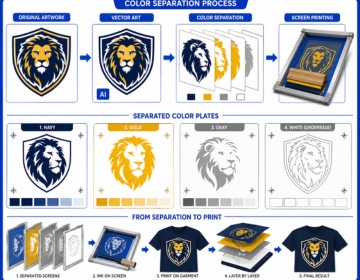
A screen printing press cannot print multiple colors in a single pass. Each color in a design gets its own screen. Ink pushes through that screen onto the fabric, one layer at a time. To build that sequence, the artwork must first be taken apart so each color becomes a standalone layer. That taking apart is color separation.
The same logic applies to embroidery. A machine carries multiple thread colors loaded on separate needles. Before it stitches anything, the file must specify exactly which thread color covers which area of the design. Color separation in digitizing is the step where those assignments get made.
Why Skipping It Destroys Print Quality
Submit an unseparated file to a screen printer and one of two things happens. Either they reject it and send it back or they attempt to separate it themselves. That second option is costly. Separating someone else's art file takes time and shops charge for it. The result is also rarely as clean as a separation built by someone who knows the design from the start. Misregistration, color bleeding at layer edges and muddy ink stacks all trace back to poor or absent separation work.
Color Separation vs Color Correction
These two steps often get confused. Color correction adjusts the visual appearance of art: fixing hues, boosting contrast, balancing highlights. Color separation prepares that corrected art for physical production by breaking it into printable layers. You do color correction first, then separation. Trying to separate a file with bad color data just locks the problems into the production workflow.
The Four Main Separation Methods
Each method serves a different type of artwork and a different production need. Choosing the wrong one wastes screens, wastes ink and produces a print that doesn't match the original design.
Spot Color Separation
Spot color is the simplest method and the most common in US garment printing. Each solid color in the design gets its own dedicated layer. No halftones, no blending. The ink for each layer is pre mixed to an exact shade usually matched to a Pantone reference. A five color design needs five screens. Nothing overlaps. Nothing blends optically.
This method works best for logos, text heavy designs and any artwork built from flat solid shapes. Sports team uniforms, corporate branded apparel and promotional item printing all run heavily on spot color separation because the results are consistent across long production runs. The same Pantone ink on the same screen prints the same shade on garment 1 and garment 500.
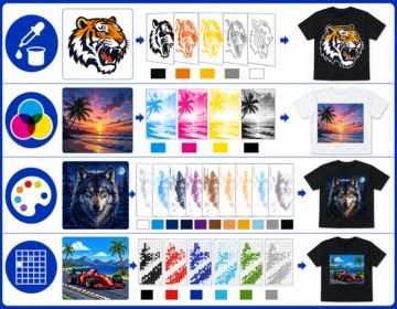
CMYK Process Separation
CMYK uses four ink colors cyan, magenta, yellow and black. Tiny halftone dots of these four colors get printed on top of each other in varying densities. The eye blends them optically and perceives a full color image. This is how magazines and commercial offset printing reproduce photographs.
On fabric, CMYK process has real limitations. The inks are semi transparent. On a white shirt, they layer cleanly. On a dark shirt, the fabric absorbs the ink and kills the vibrancy. Most US apparel screen printers use CMYK only for photographic designs on white or very light garments. The moment the garment goes dark, a different method takes over.
Simulated Process Separation
Simulated process is the answer to CMYK's dark shirt problem. Instead of four transparent inks, it uses 6 to 10 custom mixed spot colors with halftone dot patterns layered to mimic full photographic color. The inks are opaque, so they sit on top of dark fabric rather than blending into it. A white underbase layer goes down first. The color layers print on top of that underbase, not directly onto the dark shirt.
The result on a black tee can be a stunningly vibrant photorealistic image that CMYK could never achieve on the same garment. The tradeoff is complexity. Simulated process separations take longer to build, require precise halftone angles to avoid moire patterns and need careful ink stacking order. Get any of those details wrong and the print looks patchy or off color. Professional separation work is not optional here.
Index Color Separation
Index separation replaces smooth halftone gradients with a grid of solid color pixels. Each pixel in the grid is one pure ink color with no tonal transition. The result has a distinct graphic, slightly pixelated look. It's actually faster to print than simulated process because there are no halftone curves to calibrate. Index separation handles complex artwork on dark garments reasonably well and is popular in shops that prioritize throughput speed over photographic softness.
Comparison: Which Method Fits Your Design
| Method | Best For | Garment Color | Screen Count | Complexity |
|---|---|---|---|---|
| Spot Color | Logos, flat design, text | Light and dark | One per color | Low |
| CMYK Process | Photos, gradients | White and light only | 4 screens | Medium |
| Simulated Process | Photos on dark shirts | Light and dark | 6 to 10 screens | High |
| Index Color | Complex art, fast runs | Light and dark | Variable | Medium |
Color Separation for Embroidery: A Different Kind of Problem
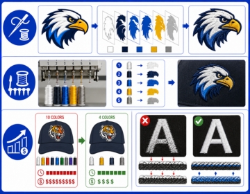
Screen printing separation and embroidery separation look nothing alike in practice. Screen printing deals with ink on screens. Embroidery deals with thread on needles. The mechanics are different but the core idea is the same each color must be mapped to its own layer before production can begin.
Thread Color Assignment
A commercial embroidery machine carries multiple thread colors on separate needle positions. Before the machine stitches a single element, the digitizer must specify which thread color belongs to which area of the design. This color assignment process is the embroidery equivalent of separation. A logo with five visible colors in the artwork gets five thread color assignments in the stitch file.
The challenge is that thread colors don't mix the way inks do. Two screen printing inks can overlap to create a third color. Two thread colors stitched in the same area just produce a tangled mess. Every color in embroidery must be a standalone zone. The separation has to be clean and precise before a single stitch gets laid down.
Color Count and Garment Cost
More thread colors mean more needle changes, more machine stops and longer run times. A 10 color embroidery design costs more to produce than a 4 color design on the same garment. Professional color separation at the digitizing stage can often reduce unnecessary color complexity without changing how the design reads visually. Consolidating two similar shades of blue into one thread color, for example, cuts a machine stop while preserving the design intent. USA Digitizing Pro handles this kind of color optimization as part of the digitizing workflow so production runs faster and cheaper.
Show Through and Underlay
Dark garment fabric can show through light colored embroidery if the stitch density and underlay are not set correctly. The underlay layer acts as a foundation that prevents the fabric color from bleeding visually into the stitched area above it. Getting this right requires the color separation to correctly identify which elements sit on dark areas versus light areas so underlay settings can be adjusted per zone. Automated separation tools miss this entirely. Human digitizers catch it before the file ever reaches the machine.
What Happens When Color Separation Goes Wrong
Misregistration is the most visible failure. It shows up as a thin colored halo around design elements where one ink layer printed slightly off position from the layer below it. At half an inch, a 1mm registration error looks like a shadow. At 12 inches on a full back print, it looks like a printing accident.
Color bleeding at layer edges is a close second. Without proper trapping, two adjacent color layers leave a thin gap or an overlap. The gap shows the garment color underneath. The overlap creates a muddy third color that wasn't in the original design. Both problems trace directly to how the separation was built, not to the press or the ink.
Here's the thing: a press operator working from a clean, properly separated file runs the job without problems. The same operator handed a poorly separated file spends setup time compensating for artwork errors. That setup time costs money, delays production and often means a substandard result regardless of how much effort goes into fixing it at the press.
How Professional Color Separation Works: Step by Step
This is how USA Digitizing Pro handles a separation order from file receipt to delivery.
- The client submits the artwork. Vector files (AI, EPS, SVG) are the cleanest starting point. High resolution raster files at 300 dpi or above also work for most methods.
- The designer assesses the artwork color count, garment color, design complexity and intended printing method. This assessment determines which separation method fits the job.
- For screen printing: each color layer gets isolated into its own channel. Halftone settings are applied where needed. Underbase layers are built for dark garment separations. Trapping is added at layer edges to eliminate gaps.
- For embroidery: thread colors are assigned per design zone. Color count gets optimized where possible. Underlay settings are flagged per zone based on garment color.
- Film positives or print ready layered files are prepared for output. For screen printing, this means a layered PSD or channel separated PDF. For embroidery, this means a complete stitch file with a correct color sequence.
- The file is reviewed at actual output size. Registration, edge sharpness and color accuracy are checked before delivery.
- Delivery within 2 to 4 hours for standard designs submitted before 3 PM CT.
What to Submit for a Clean Separation
The quality of what you send directly determines the quality of what comes back. Poor input files add time, add cost and sometimes make a clean result impossible.
- Vector artwork is the strongest starting point. AI, EPS and SVG files give the separator clean path data with exact color assignments already built in.
- If you only have a raster file make sure it is at least 300 dpi at the size it will actually print. A 72 dpi web image blown up to print size produces blurry halftones and soft layer edges.
- Specify the garment color before work begins. Dark garment separations need an underbase. Light garment separations don't. This changes the entire separation structure.
- Name your Pantone colors if you have brand standards. A note saying 'main blue is PMS 286' saves a round of revisions.
- Tell the studio how many colors you want to use. If your budget only allows four screens, the separator can consolidate similar shades without you needing to redesign the artwork.
Color Separation and Brand Consistency
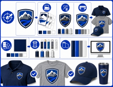
A brand that runs embroidery on polos, screen printing on t shirts and vinyl on caps faces a color consistency challenge. The same logo needs to look the same across three completely different production methods. That consistency starts at the separation stage.
Each method handles color differently. Screen printing ink color is matched to Pantone. Thread color is matched to manufacturer thread charts from Madeira, Isacord or Coats. Vinyl color is matched to a different set of material standards. A professional separation service builds each version of the same logo with the production method in mind so the finished items look like they belong together. USA Digitizing Pro handles this across all three methods from one studio, which means the color decisions stay consistent across every file format in the same order.
Real Scenario: What a Bad Separation Costs
A Dallas print shop took on a 500 piece run of hoodies for a university athletics department. The artwork was a 6 color athletic logo with tight registration between a gold outline and a dark navy fill. The client submitted a JPEG screenshotted from a website at 96 dpi.
The shop's in house separator spent two hours trying to clean the art and build usable layers from low resolution pixel data. The first press run showed edge bleed on the gold outline where the ink spread beyond its intended boundary. The shop reprinted 80 garments at its own cost. The total rework time and wasted ink added more to the job than a professional separation order would have cost at the start. That separation order from a dedicated studio would have taken under four hours and delivered a print ready file with proper trapping already built in.
Frequently Asked Questions About Color Separation
Spot color separation isolates each color in a design as its own pre mixed ink layer with no blending. Process color separation uses four inks (CMYK) printed as halftone dot patterns that blend optically to reproduce a full color image. Spot color gives you exact Pantone matched shades that stay consistent across long print runs. Process color can reproduce thousands of colors from just four inks but works poorly on dark garments because the inks are semi transparent. Most US apparel printers use spot color for logos and simulated process for photographic art on dark shirts.
There is no hard technical limit but cost and press setup time go up with each additional color. Most US apparel screen printers work comfortably in the 1 to 8 color range for standard jobs. Automatic presses can handle 10 to 14 colors on specialty work. Each color needs its own screen burned, set up on the press and cleaned after the run. A professional separator helps you consolidate similar colors where possible so you stay within your screen budget without losing the visual impact of the design.
You can if you have Adobe Photoshop or Illustrator and understand how channels, halftones and trapping work. Spot color separation for a simple flat logo is achievable with an afternoon of learning. Simulated process separation for a photorealistic image on a dark garment takes significantly more skill. Getting the halftone angles wrong or stacking ink channels in the wrong order ruins the result at the press. Most businesses find that professional separation for complex artwork costs less than the time and rework risk of attempting it without experience.
The outcomes differ because the production mechanics differ. Screen printing separation controls ink layers and halftone dot patterns. Embroidery separation controls thread color zones and stitch sequence. In embroidery, the main concerns are thread color count, clean boundaries between color zones, show through on dark garments and correct needle change order. Screen printing separation focuses on layer registration, trapping and underbase construction. Both require a human to make decisions that automated tools consistently get wrong.
AI and EPS are the strongest inputs for any separation work. They carry clean path data with exact color values and scale without quality loss. High resolution PNG or PSD files at 300 dpi at actual print size also work for raster based separation methods. JPEG files are generally too compressed for clean separation work because the compression introduces edge artifacts that show up in halftones. PDF files work if they contain embedded vector data rather than a flattened raster image.
Open the file in Photoshop and check the Channels panel. A separated file for screen printing shows individual color channels labelled by ink color rather than just RGB or CMYK. In Illustrator, a separated spot color file shows named Pantone swatches in the swatches panel assigned to each element. If your file opens as a single flat RGB image with no named color channels, it has not been separated. Send it to a professional service before submitting it to a print shop.
Get Your Artwork Separated and Production Ready
Color separation is the step that stands between a design on screen and a design on fabric. Skip it, rush it or get it wrong and every production problem that follows traces back to that gap. A properly separated file runs cleaner on press, produces sharper results and costs less in setup time and rework.
USA Digitizing Pro prepares separated files for screen printing and embroidery from its Texas studio. Spot color, simulated process, CMYK and index separations are all handled in house with turnaround as fast as 2 to 4 hours for standard work. Logos under 5 inches start at $15 flat. Complex artwork is quoted before work begins so there are no surprises.