

Spot Color vs Process Color Separation Explained 2026
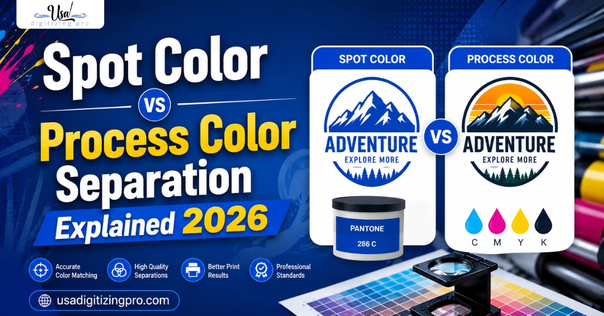
Screen printers run into this decision on almost every order: separate the artwork as spot colors or run it as a process color job. Spot color vs process color separation isn’t just a preference call. It changes how many screens get burned, how the file gets prepped, and whether the finished print matches the original artwork closely or loosely. Get the wrong method for a given design and you either waste screens on a photo that needed process color, or lose the crisp, flat look a logo needed from spot color in the first place.
Quick Answer at a Glance
What Spot Color Separation Actually Is
Spot color separation: breaking a design into individual flat solid colors, with each color printed through its own screen using a specific ink, often matched to a Pantone reference. A three-color logo becomes three screens, each holding one flat shape with no blending or gradient inside it. This method keeps brand colors exact and edges sharp, which is why most logo and text-heavy designs are separated this way. For the broader color separation workflow beyond just spot vs process, the color separation services overview covers file prep and screen count planning in more depth.
What Process Color Separation Actually Is
Process color separation breaks an image into four (or more) halftone screens, typically cyan, magenta, yellow, and black, sometimes with added simulated colors for a wider range on textiles. Instead of flat solid shapes, each screen holds a pattern of tiny dots at varying sizes and densities. Printed in layers, these dot patterns optically blend to reproduce full-color photographs, gradients, and complex shading that spot color simply can’t replicate.
Why Design Type Decides Which Method Fits
A flat logo with two or three brand colors and clean edges is a spot color job every time. A photographic image, a gradient sunset, or artwork with subtle shading needs process color’s halftone approach to reproduce that continuous tone. The mistake to avoid is running a simple flat-color logo through process separation, which adds unnecessary screens and can introduce slight color drift versus a clean spot-color match.
Screen Count and Production Differences
Spot color jobs typically use one screen per color, so a three-color design needs three screens. Process color jobs generally run four base screens (CMYK) regardless of how many colors appear to be in the final image, since the halftone blending creates the color range. This means a complex photographic image might actually need fewer screens than a five-color spot design, while a simple two-color logo run through process color would need more screens than necessary.
Simulated Process: Where the Two Methods Blend
Simulated process separation is worth knowing about since it doesn’t fit neatly into either category. It uses a limited set of specific ink colors, similar to spot color, but applies halftone screening to some of them to extend the range and create shading effects, similar to process color. This approach is common for detailed designs on dark garments where straight CMYK process wouldn’t reproduce well, giving more color depth than pure spot separation without needing a full CMYK process setup.
Color Matching Accuracy Between the Two
Spot color separation generally matches brand colors more precisely, since each screen prints one specific ink rather than relying on dot patterns to approximate a shade. This is why corporate logo work leans toward spot color even when it has three or four colors, since exact Pantone matching matters more than reproducing a photograph. Process color prioritizes overall image reproduction over precise single-color matching, since its strength is blending rather than exact flat color accuracy.
Side-by-Side: Spot Color vs Process Color Separation
How the Separation File Differs Between the Two
A spot color file assigns each screen a single flat shape with defined edges and no internal tone variation. A process color file assigns each of the four channels a halftone pattern calculated from the original image’s color data, with dot size varying across the design to create the illusion of continuous color. Getting this step wrong, treating a photo as flat spot shapes or a logo as halftone channels, produces either a muddy image or an unnecessarily complex file for a simple design.
Choosing the Right Method for Your Order
- Start with what the artwork actually is. Flat logo or text points to spot color; photo or gradient points to process color.
- Count how many distinct flat colors are in the design if considering spot color.
- Ask about simulated process if you need photo-like detail but also want tighter color control than straight CMYK.
- Confirm screen count and pricing before committing, since the two methods price differently.
- Request a print sample if color accuracy on a specific brand color is critical.
A Real Order, Broken Down
A small coffee roasting brand in Texas submitted a logo with three brand colors and a separate photographic label design they wanted printed on the same product line. The logo, being flat and color-critical to their brand guide, was separated as three spot colors matched to their exact Pantone references.
The photographic label, showing a gradient roast image, was separated using four-color process instead, since spot color couldn’t reproduce the tonal blending in the roast photograph. Running both jobs through the correct method kept the logo color exact while still letting the photographic design print with full tonal range.
Who Builds These Files
USA Digitizing Pro has separated files for both spot color and process color screen printing from its Texas studio since 2015, choosing the right method based on the artwork rather than defaulting to one approach. Turnaround and pricing depend on color count and complexity, with every order backed by a money-back quality guarantee.
Frequently Asked Questions
Spot color is generally better for logos, since it keeps flat brand colors exact and edges crisp without the dot pattern texture that process color introduces.
Yes, this is exactly what process color separation is built for. The CMYK halftone screens blend to reproduce continuous tone images like photographs far better than flat spot colors can.
Each spot color screen holds one flat shape, so a design with two or three colors only needs two or three screens. Process color always needs its base CMYK channels regardless of how simple the visual design looks.
It’s a hybrid method using a limited set of specific inks with some halftone screening applied, giving more shading depth than pure spot color without needing a full CMYK process setup.
It depends on the specific job, but process color often involves more complex file prep due to the halftone calculations across four or more channels, which can affect pricing versus a simple two or three color spot job.
Yes, through simulated process, or by running separate elements of a design through each method if the artwork has both flat logo elements and photographic elements.
Yes, spot color is limited to the specific flat colors chosen for the screens, which is why it doesn’t suit designs needing gradients or a wide color range like photographs do.
There’s no strict cutoff, but as flat color count climbs past five or six, screen costs and registration complexity often make process or simulated process more practical for the budget.
Yes. Dark garments often push designs toward simulated process rather than straight CMYK process, since standard process color assumes a white or light base to read correctly.
Look at whether the artwork is flat and color-defined like a logo, or continuous-tone like a photograph. Flat and color-defined points to spot color; continuous tone points to process or simulated process.
Choosing the Right Separation Method
Spot color vs process color separation comes down to what the artwork actually is rather than personal preference. Flat logos and brand-color text belong in spot color. Photographs, gradients, and detailed shading belong in process color, with simulated process as a middle ground for detailed designs needing tighter color control. USA Digitizing Pro separates files for both methods, choosing the right approach for the artwork at hand.

RELATED BLOGS
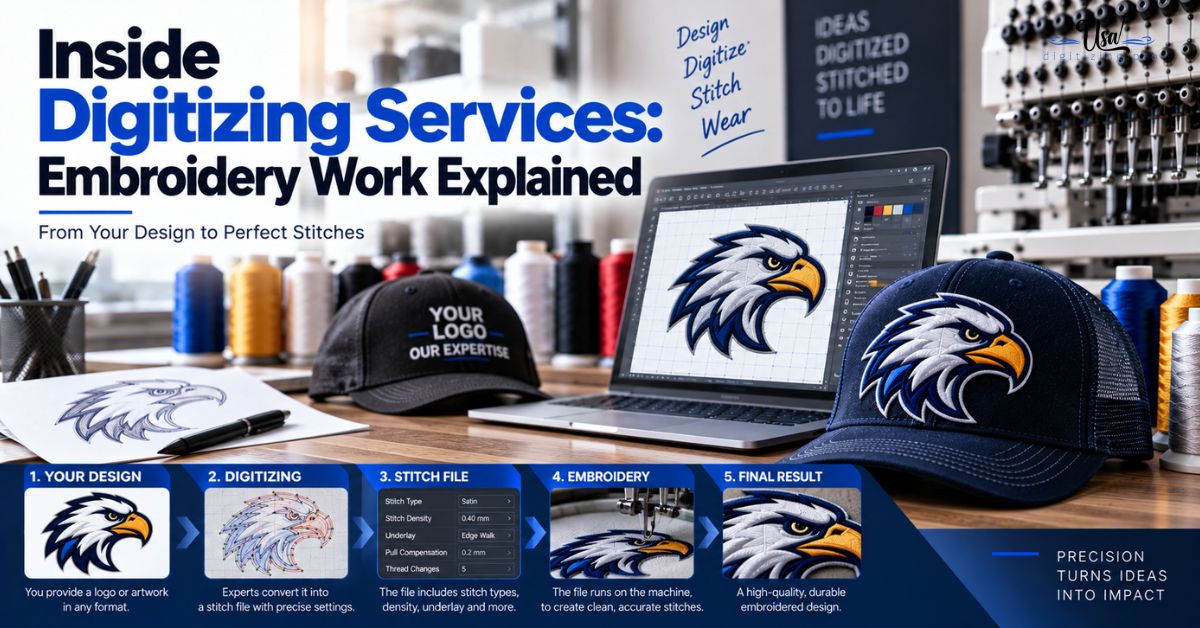
Inside Digitizing Services: Embroidery Work Explained 2026
Published September 21, 2026 | By USA Digitizing Pro Team Send the same logo to three digitizing studios and you will get.
Custom Morale Patch: Types, Materials and How to.
USA Digitizing Pro is a Texas-based embroidery digitizing studio founded in 2015. The team handles stitch file production for apparel brands, tactical.