

Transforming Designs With Digitizing Services: What Changes 2026
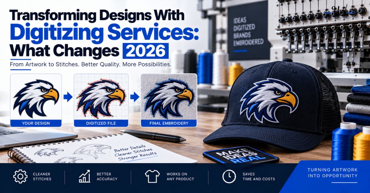
Published September 11, 2026 | By USA Digitizing Pro Team
Somebody sends a logo, gets a stitched sample back, and the first reaction is that it does not look quite like the file they sent. That reaction is correct, and in most cases the work is fine. Artwork does not get copied into thread, it gets translated, and translation involves losses that are unavoidable and additions that were never in the original. Knowing which changes are inherent and which are actual faults is what makes approving a stitch file possible rather than uncomfortable.
Quick Answer at a Glance
| Change | Inherent or Fault? | Why |
|---|---|---|
| Gradients turned into solid blocks | Inherent | Thread cannot blend the way pixels do |
| Fewer colors than the original | Inherent | Machines and thread ranges have hard limits |
| Hairline details missing | Inherent | Below roughly 0.05 inches, lines do not hold |
| Tiny text dropped or simplified | Inherent | It would stitch as an unreadable mass |
| Proportions visibly altered | Fault | Compensation should preserve the shape |
| Logo no longer recognizable | Fault | Simplification went past the brand |
| Fabric puckering around the design | Fault | Density or underlay wrong for the garment |
Why the Transformation Is Never One to One
Two facts about embroidery explain nearly every difference between a screen design and a stitched one. Neither is a limitation of the digitizer’s skill.
Thread Is a Physical Material
A screen design is light, with no thickness and effectively unlimited color. Thread has real width, sits above the fabric, catches light differently depending on stitch direction, and comes in a finite set of solid colors. Two identical shapes stitched at different angles will not look identical, because the light hits them differently. That is a property of the medium rather than a fault in the file.
Stitches Move the Fabric
As stitches go down, they pull the fabric inward and push it outward. Left uncorrected, every shape in a design finishes narrower than it was drawn and adjacent colors separate. Digitizing software compensates for this deliberately, which means the file a digitizer builds is not a direct trace of your artwork. It is a slightly adjusted version designed to land correctly after the fabric has moved. how build quality shows in the finished stitch covers how to judge whether that compensation worked.
What Always Changes
These four happen on essentially every commercial logo. If your artwork contains any of them, expect the change and judge the result on how well it was handled rather than on whether it happened.
Gradients Become Solid Blocks
Thread cannot fade smoothly from one color to another. A gradient either becomes a single solid color, or it gets stepped into two or three distinct blocks, or it gets approximated with a blending technique. None of those is the original gradient. The question worth asking is not why the gradient is gone, it is whether the chosen replacement still reads as the brand.
Color Count Drops
Most embroidery machines top out around fifteen thread colors in a single design, and many services work to a lower practical limit than that. The full commercial thread range runs to several hundred solid colors, which sounds like plenty until you compare it to the effectively unlimited color of a digital file. Any artwork with dozens of tonal variations gets consolidated into a much smaller palette.
Thin Lines and Small Text
There is a physical floor below which a line cannot hold as stitches, commonly cited in US guidance at around 0.05 inches, roughly 1.27mm. Hairline strokes below that break up or disappear. Small text has its own threshold, below which letters merge into an unreadable mass regardless of how carefully they are built. Both get thickened, enlarged, or dropped. the settings behind common digitizing faults covers those size limits in detail.
Photographic Detail
Photographs and photo-realistic artwork do not convert directly. Continuous tone has to be interpreted into a limited set of solid shapes, which is a creative decision rather than a technical conversion. The result can be excellent, and it will never be the photograph. Anyone expecting a photographic match is measuring against something embroidery does not do.
What Gets Added That Was Never in Your Artwork
Translation runs in both directions. A stitch file contains several structures that have no equivalent in the original design, and every one of them is necessary.
Underlay
Before any visible stitching runs, a foundation layer goes down to anchor the fabric and support what comes after. You never see it in the finished piece, and without it the visible stitching sits on unstable fabric and distorts. This is invented entirely by the digitizer, matched to both the element and the garment. the underlay settings explainer covers the types involved.
Pull Compensation
Shapes get widened slightly beyond their drawn dimensions so that after the fabric pulls in, they finish at the intended size. Measured against the original artwork, a well-built file is technically wrong in several places on purpose. Measured against the finished garment, it is correct, which is the only measurement that matters.
Sequencing, Stops, and Trims
The file also carries a running order: which element stitches first, where the machine pauses for a color change, where threads get trimmed, and how the needle travels between areas. None of that exists in a logo. All of it affects how long the design takes to run and how much hand finishing it needs afterward. the stitch types overview covers the utility stitches doing this work.
What Should Not Change
Here is the other half of the answer, and the part that lets a buyer push back with confidence. Three things should survive translation intact, and if they have not, that is a fault rather than a limitation.
Proportions
Compensation adjusts dimensions slightly to offset fabric movement, and the finished piece should still read with the same proportions as the original. Letters noticeably wider or narrower than they should be, or a mark that has visibly squashed, is a compensation problem rather than an inherent one.
Recognizable Shapes
Simplification removes what thread cannot carry. It should not remove what makes the logo identifiable. If the simplified version needs explaining to someone who knows the brand, the simplification went too far and the file needs revisiting, not the expectations.
Brand Color Relationships
Exact colors may shift slightly because thread ranges are finite, and that is normal. The relationships between them should hold: if two colors contrasted strongly in the original, they should still contrast strongly in thread. A palette that has gone flat or where two previously distinct colors now read as similar is a thread selection issue worth raising. converting artwork to clean vector paths covers keeping color references documented from the start.
The Color Reduction Conversation
Color causes more back and forth than any other part of the transformation, largely because the constraints are invisible to the person sending the artwork.
Machine and Service Limits
A machine has a fixed number of needles, and every color beyond that count means manual rethreading mid-run. This is why services work to practical color limits well below what the machine could theoretically manage. On a production run, each additional color costs time on every single garment, so reducing the palette is an economic decision as much as a technical one.
Blending Versus Banding
Where a gradient has to be suggested rather than dropped, digitizers interlock two thread colors with irregular stitch lengths so the boundary between them breaks up rather than forming a hard line. Done well, the eye reads a transition. Done poorly, you get visible stripes where each color starts and stops. If a blended area in your sample shows obvious banding, that is worth flagging.
Approving a Stitch File Properly
Approval works best when it checks the right things. These six separate inherent changes from faults quickly.
Approval Checklist
- Confirm the logo is still recognizable at the distance it will be seen, not at arm’s length.
- Check proportions against the original rather than checking exact dimensions.
- Verify that color contrast relationships still hold, even if exact shades shifted.
- Look for banding in any blended areas.
- Check the fabric around the design lies flat, which is a fault signal rather than a limitation.
- Accept gradient flattening, color reduction, and dropped hairlines as inherent, then judge how well they were handled.
A Real Order, Broken Down
A Texas coffee roaster sent a logo with a gradient sunrise behind a wordmark and asked why the sample came back with three flat bands of color instead. That part was inherent, since thread does not fade. What was worth raising was that the bands showed clear stripes rather than interlocking, so the transition looked like a mistake rather than a design choice. Rebuilding the blend with irregular interlocking stitch lengths fixed the banding while keeping the same three colors. The wordmark itself had come through with correct proportions and contrast, which told them the file was otherwise sound. the step by step digitizing process covers where these decisions get made during a build.
Who Builds These Files
USA Digitizing Pro translates artwork into stitch files from its Texas studio, making the simplification decisions deliberately and documenting what changed and why. Pricing starts at $15 for designs under 5 inches, with a 2 to 4 hour turnaround and a money-back quality guarantee. Service details are on the logo embroidery digitizing page, and delivery formats are covered in the file format guide.
Frequently Asked Questions
Because thread is a physical material with real thickness and a finite color range, and stitches move the fabric as they go down. Gradients, fine detail, and large color counts all have to be translated rather than copied.
Not smoothly. A gradient becomes a solid color, a series of stepped blocks, or an interlocked blend between two threads. None of those is the original gradient, though a good blend reads as a transition.
Most machines top out around fifteen in one design, and services typically work to a lower practical limit because each extra color costs time on every garment in the run.
US guidance commonly cites around 0.05 inches, roughly 1.27mm, as the practical minimum. Lines thinner than that break up or disappear and usually get thickened or dropped.
Because below a certain size, letters merge into an unreadable mass no matter how they are built. The options are enlarging the text, simplifying it, or leaving it out, and leaving it out is often the right call at cap or left chest scale.
Yes. Pull compensation deliberately widens shapes so they finish correctly after the fabric draws in, which means the file measures differently from the artwork on purpose.
A foundation layer stitched before the visible design to anchor the fabric and support the top stitches. It does not appear in your artwork and is invisible in the finished piece, and without it the design distorts.
When proportions are visibly altered, when the logo is no longer recognizable, when color contrast relationships have collapsed, or when the fabric puckers around the design.
Judge It Against What Thread Can Do
Transforming a design into stitches is a translation with known losses and necessary additions. Gradients flatten, palettes shrink, hairlines go, and underlay and compensation appear that were never in your file. All of that is the medium. What should survive is the proportion, the recognizability, and the contrast relationships that make the logo yours. Check those three, accept the rest, and approval stops being a judgment call.
Follow Us

RELATED BLOGS
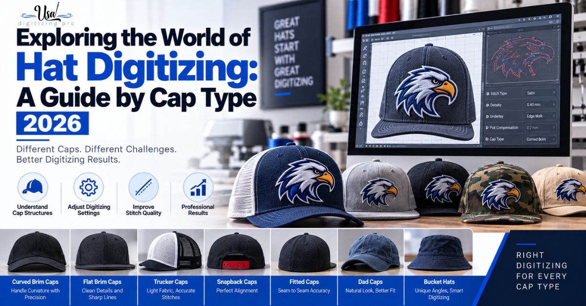
Exploring the World of Hat Digitizing: A Guide.
Published September 11, 2026 | By USA Digitizing Pro Team Hat digitizing gets treated as one skill, and it is closer to.