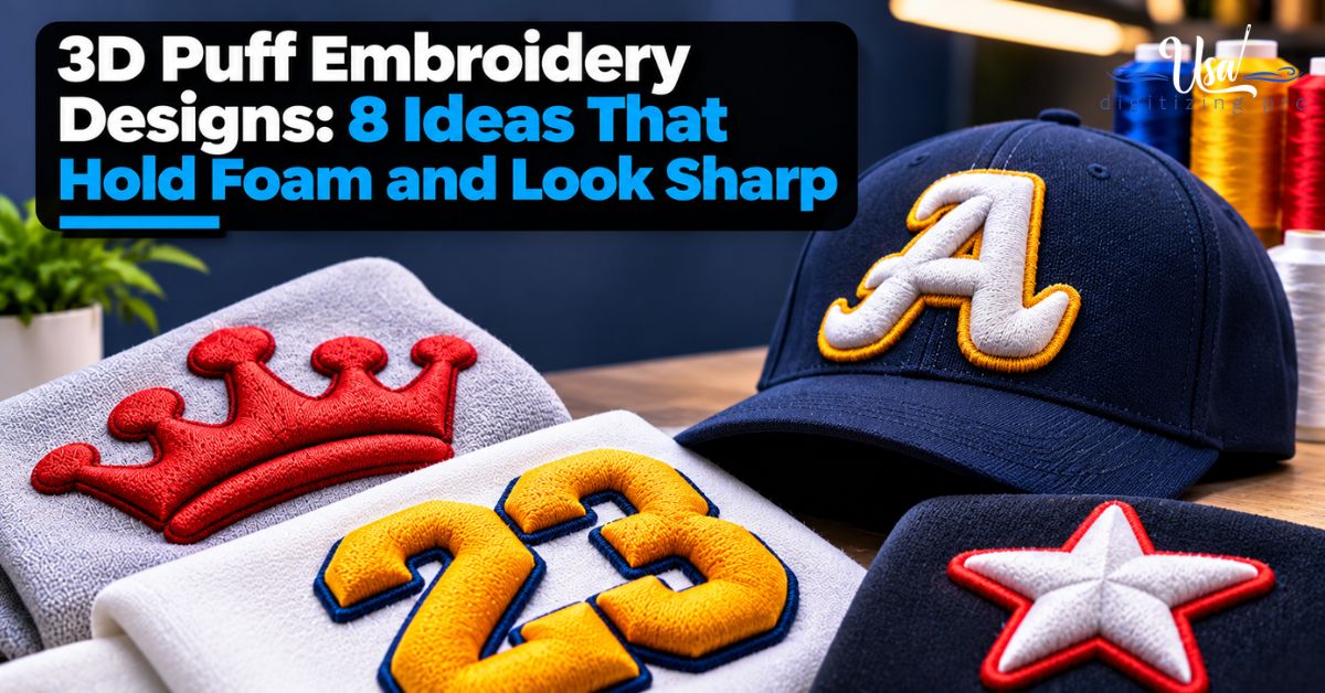
3D Puff Embroidery Designs: 8 Ideas That Hold Foam and Look Sharp
By USA Digitizing Pro Team | Published November 2026 | Updated November 2026
What makes a puff cap catch your eye? Shape. Not color. The best 3D puff embroidery designs are planned around foam from the very first sketch: thick strokes, open spacing, clear outlines. Start from a busy logo instead and the foam fights every single detail. Below you’ll find eight design ideas that stitch cleanly in puff, the designs that don’t and a short prep list for your artwork. When the design is ready, our 3D puff digitizing services build the file by hand.
Quick Answer
Good 3D puff embroidery designs use bold shapes, thick even strokes, letters about 6mm tall or more and open space between elements. Wordmarks, monograms, numbers, simple icons and hybrid designs that mix puff with flat details work best. Fine lines, small text, gradients and photos don’t.
| Design idea | Why it works in puff |
|---|---|
| Bold wordmark | Thick letters hold foam evenly |
| Monogram | Few shapes, high impact |
| Team numbers | Simple, wide strokes |
| Simple icon | Clean outline, no fine detail |
| Hybrid puff and flat | Puff for impact, flat for detail |
| Tonal puff | Same thread color as cap, depth does the work |
| Outlined puff | Flat outline frames raised fill |
| Badge with puff center | Flat badge shape, puff word inside |
Have a design in mind? Send it to art@usadigitizingpro.com with the cap style and size. Anything that won’t hold gets flagged before we build.
What Makes a Design Work in 3D Puff?
Width. Simplicity. Each raised part has to be wide enough for satin to cover the foam from edge to edge. Puff can’t follow fine detail the way flat stitching can, as our flat embroidery vs 3D puff comparison shows. It rewards thick shapes with clean edges. Keep letters about 6mm tall or more. Leave space between them. And keep the number of puff colors low.
1. Bold Wordmark
The classic. A single brand name in heavy letters reads from across the street and needs nothing else. Pick a font with even, thick strokes. Styles that hold foam are listed in our post on 3D puff embroidery fonts. Center the word on the front panel. Leave a little room above the bill.
2. Monogram or Initials
One to three letters. Premium look, very clean. You’ll see these on luxury caps and corporate gifts all the time. Interlocking monograms need extra thought. Where letters overlap, someone has to decide which one sits on top. That keeps stitches from stacking too high. That decision is made in the file.
3. Team Numbers
Numbers puff beautifully. Their strokes are simple and wide. Jersey-style numbers on caps and beanie patches make a strong sports merch look. Want a varsity feel? Add a thin flat outline in a second color. The outline stays flat. The number stands up.
4. Simple Icon
A star. A lightning bolt. A simple animal shape. Bold icons work as long as they don’t have thin points or tiny gaps. Sharp, narrow tips are the weak spot here. Satin can’t cover foam at a fine point. Round the tips slightly. Or thicken the shape near the ends.
5. Hybrid Puff and Flat
This is the most useful idea on the list for real-world logos. The bold part goes in puff. The fine part stays flat. One file holds both. A common layout puts a puff wordmark on top with a small flat tagline below. The machine stops for foam only on the puff section. It’s a smart way to keep brand details without cramming them into foam (which never ends well).
6. Tonal Puff
Black on black. White on white. Tonal puff uses thread that matches the cap color. The raised shape draws the design with light and shadow. It looks clean and expensive. Structured caps suit it best. Match the foam color to the thread so no gaps show at the edges.
7. Outlined Puff
A raised fill framed by a thin flat outline. You get contrast without adding more puff. The outline gives the shape sharp edges while the center stands up. Keep it as a flat satin or run stitch around the puff, not over it. As a bonus, it hides small edge gaps.
8. Badge With a Puff Center
A flat badge, shield or circle with a puff word or number inside. Detail and depth in one design. The badge carries small text and borders. The main word pops. Clubs, schools and brands chasing an emblem look love this one. Keep the puff word large. Keep the badge details flat.
Which Designs Should You Avoid in Puff?
Thin lines. Small text. Gradients. Photo detail. Lots of tiny shapes. Puff turns all of those into lumps. Scripts with thin joins, distressed textures and highly detailed mascots cause the most trouble. Keep them flat. Or simplify them into a puff-only version of the logo.
How Should You Prepare Your Artwork?
Before you send a puff design, check these:
| 1 | Raised letters are about 6mm tall or more at the final size. |
| 2 | Every raised stroke looks thick, with no hairlines or sharp narrow points. |
| 3 | Elements have clear space between them. |
| 4 | Fine details are marked to run flat. |
| 5 | The cap or garment style is known, such as structured, trucker or hoodie. |
| 6 | Puff colors are limited to two or three. |
Here’s how that plays out. A coffee brand wants its round logo puffed on caps. The logo has a bold name in the center and a ring of small text around it. So only the center name gets puffed. The ring of text stays flat inside a flat circle. The brand approves the hybrid version before anything is built.
Which Garments Suit These Designs?
Structured caps and trucker hats suit every idea above. Soft garments need extra care or a patch. On curved cap fronts, stay inside the safe area: about 5 inches wide and 2.25 inches tall for most structured caps, as our cap digitizing page explains. Softer items are covered in 3D puff embroidery on hoodies and 3D puff embroidery patches. Cap structure changes things too, as laid out in structured vs unstructured caps digitizing.
About the Author
USA Digitizing Pro Team. Puff designs have been digitized by hand here since 2015 for US cap brands, sports teams and decorators. Every puff design is reviewed for suitability before the file is built.
Frequently Asked Questions
Bold wordmarks, monograms, numbers, simple icons and hybrid puff and flat designs look best.
Usually only its boldest part, with the details stitched flat in the same file.
There’s no fixed limit; two or three puff colors keep the file and production simple.
Yes, same-color thread on a same-color cap lets shadow create the design for a premium look.
Yes if the design is small and bold, with its own file built for the side panel.
It helps; our vector art services can redraw a low-quality image first.
Plan Your Puff Design, Then Order the File
The best 3D puff embroidery designs stay bold, simple and spaced out. Fine details stay flat. Pick one of the eight ideas above or send your own. Email USA Digitizing Pro. It gets reviewed before we build. Start your puff order.
Follow Us

RELATED BLOGS
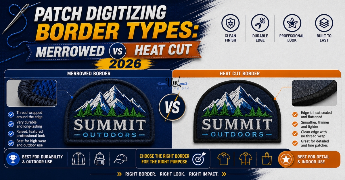
Patch Digitizing Border Types: Merrowed vs Heat Cut.
Two identical patch designs can come out looking completely different depending on one decision made before digitizing even starts: how the edge.
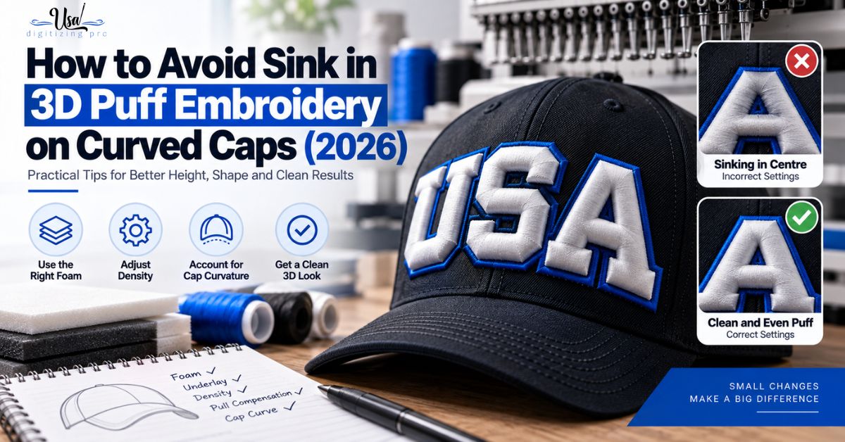
How to Avoid Sink in 3D Puff Embroidery.
Published September 11, 2026 | By USA Digitizing Pro Team A puffed logo that stands proud at the outer letters and loses.