

The Art of Hat Machine Embroidery: Making a Cap Logo Look Right 2026
Published October 3, 2026 | By USA Digitizing Pro Team
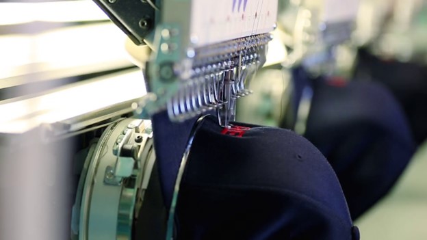
The art of hat machine embroidery is not the thread and it is not the machine. It is optical correction. A cap front curves, carries a seam up its middle, and sits under a bill that throws its own shadow. Put a geometrically perfect logo on that surface and it will look wrong, and it will look wrong in ways you can predict and correct for before anything gets stitched.
That is the craft. Not making the design correct, making it look correct once the surface bends it. This article names the four corrections that do most of the work, gives the US placement numbers they rest on, and explains why the flat proof you approved does not tell you what the cap will look like.
Quick Answer at a Glance
Here are the decisions that separate a cap logo that reads well from one that reads awkwardly. The rest of the article explains each one.
| Decision | What to do |
|---|---|
| Vertical position | Sit slightly below the midline between the bill peak and the top seam, not dead center |
| Clearance from bill | At least 0.5 inches |
| Height, structured cap | Up to 2.25 inches |
| Height, dad hat | 1.75 to 2 inches |
| Height, trucker hat | Up to 2 inches |
| Minimum text height | 0.25 inches |
| Baseline | Arc it to follow the panel rather than running it flat |
| Visual weight | Keep the heavier elements low, since the crown area distorts and the bill shades the bottom |
| Center seam | Design around it, not through it |
Why a Cap Front Is Not a Canvas
Three features of a cap front do the distorting. Each one is physical, each one is predictable, and together they explain almost every cap logo that looks slightly off without anyone being able to say why.
Three Things Happen at Once
First, the panel curves horizontally across the front and rises vertically from the bill seam toward the crown. Stitches do not sit on a flat plane, and the material moves as the needle works across it. Second, firm backing behind that curve means the fabric resists where you want it to give. Third, the viewer is almost never looking at the cap straight on. A cap is read from the front and slightly below, at an angle the design was never previewed at.
Flat artwork assumes none of this. It assumes a viewer looking straight at a still surface. Every correction in this article exists to close that gap.
The Seam Splits the Field
On a six-panel cap a seam runs up the center of the design area. It deflects the needle, it changes fabric thickness mid-stitch, and visually it draws a line through whatever sits on top of it. Digitizing guidance is blunt about the production side: avoiding dead center is the most reliable way to reduce the puckering and distortion the center seam causes. The faults that follow when it gets ignored are covered in our walkthrough of cap embroidery faults and their causes.
The composition consequence is separate and just as real. A thin vertical element landing on the seam will look bent whatever the stitch quality. A logo with an open center handles the seam gracefully. A logo with a single narrow upright in the middle does not, and that is a layout problem rather than a settings problem.
The Bill Casts a Shadow
Cap mockup guidance makes a point worth borrowing: a cap front is structured and curved, a seam runs up the middle, and the bill casts its own shadow. That shadow is not decoration. It sits across the bottom of the design field in most lighting, which darkens the lower portion of anything placed low and reduces contrast there.
So the bottom of a cap design is working against shade and the top is working against curve. The usable sweet spot is narrower than the frame suggests, and it is the reason cap layouts tend to look nothing like the same logo sized for a chest. The body differences between structured and unstructured cap bodies shift the sweet spot further still.
The Four Optical Corrections
These four adjustments do the heavy lifting. None of them is about stitch settings. All of them are about how the finished cap will be seen, which is why they get decided during layout rather than during digitizing.
Correction One: Shift Down, Do Not Center
The most common cap mistake is placing a design too high or too close to the seam. The standard correction is to shift it slightly downward and keep it centered horizontally. US placement guidance gives the target directly: position the logo slightly below the midline between the peak and the top seam.
The reason is the viewing angle. Because a cap is read from below, a design placed at true vertical center appears to ride high and lean away from the viewer. Dropping it a little brings it back into what the eye reads as centered. Mathematical center and visual center are not the same point on a curved surface, and the eye wins.
Correction Two: Arc the Baseline to Match the Panel
A flat baseline on a curved panel fights the panel. Text set straight across a cap front looks like it is sliding off at the ends, because the surface it sits on is rising away on both sides. Arcing the baseline so the stitching follows the curve of the panel removes that effect. The mechanics of setting and holding that arc are a separate craft, covered in our piece on curved lettering mechanics.
The judgment part is how much arc. Too little and the text still reads as flat. Too much and it reads as a logo from a souvenir stand. The useful rule is that the arc should match the panel rather than exceed it, so the lettering looks like it belongs to the cap instead of being imposed on it.
Correction Three: Weight the Lower Half
Visual weight is where cap layouts most often go wrong, and the fix is counterintuitive. Because the crown area distorts and the bill shades the bottom, the strongest and most readable band of a cap front is the lower middle. Heavy elements belong there.
In practice that means an icon above text often reads worse on a cap than the same elements side by side, with the text carrying the lower band. It also means a design with a wide base and a light top sits more comfortably than one weighted at the top, which will appear to tip backward as the panel curves away.
Correction Four: Respect What Happens Near the Crown
Digitizing sources describe this precisely: as a design sews toward the top of the cap, vertical lines can appear distorted as the cap moves. The upper region of the field is the least reliable place to put anything that depends on being straight. Long uprights, tall thin letters, and narrow columns all suffer there. Which stitch can hold those shapes at all is a separate constraint, set out in our reference on stitch types and their width limits.
The correction is to reserve the crown region for forgiving shapes. Horizontal elements, rounded forms, and fills tolerate it. A thin vertical bar does not. If the logo has one, it belongs lower.
Raised work changes this calculus again, since foam adds physical height to the distortion. Our notes on raised foam on cap fronts cover what the foam does to column widths and why the crown region is the riskiest place to put it.
The Numbers That Hold
Optical judgment still needs boundaries. These are the published US figures worth designing against, and they are consistent enough across decorator and print-on-demand guidance to treat as working limits.
Height by Cap Style
Recommended design height varies by cap. Structured caps including baseball caps and snapbacks take up to 2.25 inches of height. Dad hats sit lower at 1.75 to 2 inches. Trucker hats take up to 2 inches. Front-center placement gives the most visibility across all styles and is the most common choice.
Those numbers are small, and they are the reason a chest logo rarely transfers to a cap by scaling. A 3 inch tall lockup has to be rebuilt rather than reduced, because reducing it pushes its smallest elements below the width where stitches can hold them.
Minimums That Protect Legibility
Two floors matter. Designs should clear the bill by at least half an inch, which protects both the stitching and the look. Text should be at least a quarter inch tall to stay clear. Below that, letter counters close up and the word turns into a shape. The same thinking governs corner handling in satin paths, where small geometry breaks down first.
Treat both as hard floors rather than targets. A tagline that only fits at a fifth of an inch is a tagline that does not belong on the cap, and moving it to a sleeve or a back panel is a better answer than stitching it badly.
Why the Flat Proof Lies
Here is the part that costs buyers the most money. Approving a flat proof feels like approving the cap. It is not, and the mismatch is structural rather than anyone’s fault.
A Logo Pasted Flat Reads as a Sticker
Mockup guidance describes the failure well: pasting a flat logo straight onto a cap image makes it sit there like a sticker, with no curve, no thread texture, and no shadow. That flat preview tells you the design exists. It tells you almost nothing about scale, placement, or how the embroidery will read on a shape that wraps and bends.
Which means approval based on a flat proof is approval of the artwork, not of the cap. Both parties usually believe otherwise, and that is where disappointment comes from.
What to Look At When Approving a Cap Proof
A useful cap proof shows four things. It shows the artwork curved with the front panel rather than laid flat on it. It shows visible thread texture, meaning raised stitching with some sheen rather than a printed appearance and It shows the bill shadow, so you can judge contrast at the bottom of the design. And it shows where the center seam falls relative to your design elements.
Multiple angles help more than people expect. A front view, a three-quarter view, and a side profile together reveal problems that no single straight-on image shows, because the cap is read from an angle in real life.
The Sewn Sample Still Decides
No render replaces a stitch-out. A sample on the actual cap, in the actual color, tells you what the thread does against that fabric and what the shadow does to your darkest color. It is also the only way to catch a distortion that the file predicted correctly and the panel disagreed with.
For a run of any size, sewing one is cheaper than redoing the run. For a brand program it is not optional.
Where Composition Meets Settings
The split between art and technique is cleaner in theory than in practice. Layout decisions quietly set technical limits, and knowing which ones saves a revision.
Layout Changes Which Stitch You Can Use
Shorten a letter and you narrow its strokes, which can push a satin column below the width it needs and force a different stitch. Arc a baseline and the outer letters want slightly different compensation from the inner ones. Drop a design lower and the underlay has to deal with a different part of the panel, which is why the underlay built for cap panels is set after the layout is settled rather than before.
This is the practical argument for sending artwork and cap details together rather than separately. Our artwork submission checklist for caps covers what to include, and it exists because a digitizer who knows the cap can make these calls once instead of twice.
Cap Proof Review Checklist
Run this before approving any cap proof. Each item maps to a correction or a number above, and every one is faster to check now than to discover on a finished run.
| Checklist | Question |
|---|---|
| 1. Vertical position | Is the design sitting slightly below the midline between the bill peak and the top seam? |
| 2. Bill clearance | Is there at least half an inch of clearance from the bill? |
| 3. Total height | Is total height within the limit for this cap style? |
| 4. Text height | Is any text at least a quarter inch tall? |
| 5. Baseline arc | Does the baseline arc follow the panel, and does the amount of arc look natural? |
| 6. Center seam | Where does the center seam fall, and is anything thin and vertical sitting on it? |
| 7. Visual weight | Is the heaviest part of the design in the lower middle band? |
| 8. Straight elements | Is anything near the crown that needs to read as perfectly straight? |
| 9. Proof appearance | Does the proof show curve, thread texture, and bill shadow, or is it a flat paste? |
| 10. Actual cap sample | Has a sample been sewn on the actual cap in the actual color? |
A Real Order, Broken Down
An Austin coffee roaster sent us a logo that had been working everywhere else. A circular badge, a cup icon inside it, and the roaster name arching along the top of the circle. On a tote and on a storefront window it was excellent.
On a cap it had three problems and only one of them was technical. The badge was round, so at 2.25 inches of available height it was also only 2.25 inches wide, which left most of the cap front empty and made the badge look undersized. The arching name sat along the top of the circle, which put the smallest text in the crown region where vertical strokes distort. And the circle’s left and right edges, being the thinnest part of the outline, crossed the center seam area at the point where the outline was weakest.
We kept the badge and changed the composition. The circle came down to 1.9 inches and moved slightly below the vertical midline. The roaster name came out of the arch inside the badge and became a separate arced line to the right of it, set at 0.3 inches tall, which cleared the text minimum with room to spare. The cup icon stayed inside the circle where the crown distortion could not touch it, because a cup silhouette is a rounded form and tolerates the curve. Total footprint went from 2.25 by 2.25 inches to 1.9 by 4.0 inches, which filled the panel properly.
The client’s first reaction was that we had changed their logo. The sewn sample ended that conversation in about four seconds. The badge was intact, it was simply no longer fighting the cap.
Who Builds These Files
USA Digitizing Pro has been building embroidery and vector files from a Texas studio since 2015. Cap work is a large share of it, which means layout review comes before digitizing rather than after. If your logo needs rebuilding for a cap front we will say so up front and show you why.
Digitizing starts at $15 for designs under 5 inches and $25 for designs above 5 inches, with 2 to 4 hour turnaround and a money-back quality guarantee. See cap digitizing for cap-specific work and logo digitizing when the same mark has to work across several garment types. You keep the production file either way. Reach us at sales@usadigitizingpro.com or +1 (830) 321-7832.
FAQs About Art of hat machine embroidery
Front and center horizontally, and slightly below the midline between the bill peak and the top seam vertically. Front-center placement gives the most visibility on every cap style. The downward shift is the correction that matters, because a design at true vertical center appears to ride high once the panel curves away from the viewer.
It depends on the cap. Structured caps including baseball caps and snapbacks take up to 2.25 inches of height. Dad hats take 1.75 to 2 inches. Trucker hats take up to 2 inches. Those are height limits, and the usable width is normally far greater than the height, which is why cap logos work best as wide, short shapes.
At least half an inch. That clearance keeps the stitching off the thickest part of the seam and keeps the design out of the deepest part of the bill shadow. Going closer makes both the production and the appearance worse at the same time.
Two different causes share that symptom. Mechanically, it is usually flagging, where the unsupported panel lifts as the needle rises and moves the fabric before the stitch sets. Visually, it can be a flat baseline on a curved panel, which makes straight text look like it is sliding off at the ends. Check the frame and backing first, then look at whether the baseline was arced.
Usually yes. Stitching that follows the curve of the panel looks settled, and text set flat across a curved front looks imposed on it. The judgment is in the amount. Match the arc to the panel rather than exceeding it, because an over-arched line reads as novelty rather than as branding.
The Craft Is in the Correction
Everything in this article is a response to one fact. A cap front bends, and the eye reads the bend. A design built for a flat surface and dropped onto that panel will be geometrically perfect and visually slightly wrong, every time.
Good cap work anticipates that instead of discovering it. The design drops a little, the baseline follows the panel, the weight sits low, the thin verticals stay out of the crown and off the seam, and the numbers get respected. None of that is visible in the finished cap, which is exactly the point. What people notice is that the logo looks like it was made for the hat.
Follow Us

RELATED BLOGS

Embroidery Digitizing Mistakes: The Setting Behind Each One.
Published August 17, 2026 | By USA Digitizing Pro Team Every list of digitizing mistakes names the same problems andalmost none of.

Threading Stories Into Fabric: Handwriting Into Stitches 2026
Published September 21, 2026 | By USA Digitizing Pro Team Most embroidery digitizing is company logos headed for uniforms. A smaller and.
2 COMMENTS
[…] from an extra color costs less on every piece. Craft and cost are aligned here rather than opposed. what drives hat embroidery pricing covers where color count sits in a […]
[…] it is quiet. It is the same technique that direction contrast enables, applied deliberately. how stitch direction creates separation without color covers why that […]