

How to Separate Colors for Screen Printing: 7 Steps 2026

Published August 17, 2026 | By USA Digitizing Pro Team
Separating colors is where a design either becomes printable or becomes a problem the press operator inherits. Most guides explain the concept and stop before the settings that actually matter: what LPI to use, what angle to set your halftones at and where the underbase belongs in the channel order. This walks the full workflow the way US shops run it, then covers the halftone and trapping settings that decide whether the finished print registers cleanly.
Quick Answer at a Glance
| Question | Answer |
|---|---|
| What’s the core separation process? | Isolate each color into its own channel, convert to spot channels, order them, output as films |
| What LPI should I use on garments? | Generally 45 to 65 LPI, lower on coarse fabric and higher on smooth shirts with fine mesh |
| What halftone angle should I set? | 22.5 degrees is the standard across the industry for avoiding moire |
| What artwork resolution do I need? | 300 to 600 DPI, since DPI sets resolution while LPI sets dot spacing |
| Do I need an underbase? | On dark garments yes and it counts as its own screen in the color count |
| What order do the screens print in? | Light to dark, with the underbase first on dark garments |
| What does color separation cost? | Starting at $15 for designs under 5 inches, larger work quoted individually |
Before You Separate: Three Things to Confirm
Separating without these three answers is how files get rebuilt. Each one changes the channel count or the settings you’ll use, so confirm them before opening the artwork.
Garment Color and Whether You Need an Underbase
On a white or light garment, ink colors read as intended because the garment supplies the light base. On a dark garment they don’t, since screen printing inks are only partly opaque. A white or light underbase layer gets printed first so the colors on top have something to sit against. That underbase is a full screen of its own, so a design that looked like four colors becomes five on a black shirt.
Your Press Capacity in Colors
The number of stations on the press caps how many screens can run in one pass. If the separation produces more channels than the press has heads, either the design gets simplified, colors get combined or the job runs in multiple passes. Confirming this first avoids separating to eight channels for a six color press. the run size and setup cost guide covers how screen count drives cost across different order volumes.
Artwork Resolution and Format
Halftone output needs artwork at 300 to 600 DPI. Anything meaningfully lower produces soft, jagged dots on the film. Vector artwork sidesteps the resolution question for flat spot work entirely, which is one reason flat logo separations start from vector whenever possible. If you’re beginning from a photo or a low resolution logo, converting the raster image to clean vector paths comes before separation rather than after.
The Seven Step Separation Workflow
This is the spot channel workflow used for flat color and simulated process work in Photoshop, which covers the majority of garment printing in US shops. Straight CMYK process separations follow a shorter path since the channels already exist.
Step 1: Set the Document Mode and Flatten
Open the artwork and set the color mode appropriately for the job, then flatten the layers onto a white background. Working from a flattened image means the Color Range selections read actual pixel colors rather than being confused by layer transparency and blend modes.
Step 2: Pull Each Color With Color Range
Use Select then Color Range and click the color you want to isolate with the eyedropper. The Fuzziness slider controls how much of that color’s range gets included, so widen it to catch shading variations and narrow it to keep the selection tight. This step gets repeated once per color in the design.
Step 3: Save the Selection as a Channel
With the selection active, save it as a new channel from the Channels panel. This creates an alpha channel holding that color’s coverage. At this stage it’s a grayscale mask rather than a printable color, which the next step corrects.
Step 4: Convert Alpha Channels to Spot Channels
Double click each new channel and change it from an alpha channel to a spot color channel, then set its color swatch to match the ink you’ll actually print. Spot channels are what output as separate films, so this conversion is what turns a mask into a printable separation.
Step 5: Order the Channels Light to Dark
Arrange the spot channels in print order, running light colors first and dark colors last, with the garment color reference at the top of the stack. Print order affects how the inks build on each other and getting it backwards produces muddy overlaps where a dark ink sits under a light one.
Step 6: Build the Underbase if the Garment Needs One
On dark garments, generate the underbase channel from the combined coverage of the printing colors, then place it first in the order so it lays down before anything else. Plan it from the start rather than adding it at the end, since it affects the total screen count and therefore the press setup. the complete separation types reference covers which separation methods need an underbase and which handle dark garments natively.
Step 7: Output the Films Through a RIP
Print the separations from the print dialog with separations selected and let the RIP software handle color rather than the printer driver. A RIP is what generates proper halftone dots at the LPI and angle you specify. Sending halftones through a standard printer driver produces inconsistent dot shapes that expose unevenly on the screen.
Halftone Settings That Decide Print Quality
Halftones turn continuous tone into printable dots and three settings control how well that works. Getting these wrong is the most common reason a technically correct separation still prints badly.
Choosing Your LPI by Fabric and Mesh
Lines per inch sets how closely halftone dots sit together. For garment printing, 45 to 65 LPI is the working range. Coarser fabrics and lower mesh counts call for the lower end, around 35 to 45, since fine dots simply fall through or fill in. Smooth shirts printed through fine mesh support the higher end, 55 to 65, which holds more detail.
Why 22.5 Degrees Is the Standard Angle
Halftone angle determines how dot grids from different screens interact. When two screens sit at conflicting angles, their dot patterns interfere and produce moire, a visible repeating pattern that ruins the print. The screen printing industry standard is 22.5 degrees across all screens regardless of whether the job is single color tonal, multi color spot, simulated process or CMYK.
Artwork Resolution Behind the Halftone
DPI and LPI are separate settings that people routinely conflate. DPI is the resolution of the artwork itself and LPI is the spacing of the halftone dots generated from it. Artwork at 300 to 600 DPI gives the RIP enough information to build clean dots at typical garment LPI values. Low resolution artwork produces ragged dot edges no LPI setting can rescue.
Trapping and Registration
Presses do not register perfectly. Garments shift slightly, screens move fractionally and adjacent colors that meet exactly in the file end up with a hairline gap on press. Trapping is the deliberate overlap that absorbs that movement.
Why Adjacent Colors Need Overlap
Where two colors share a boundary, extending one slightly under the other means small registration drift shows as a marginally thicker seam rather than as bare garment showing through. Without trap, the same drift leaves a visible white line along the boundary, which is the single most obvious sign of an untrapped separation.
How Much Trap Is Enough
Trap needs to cover realistic press movement without creating a visibly heavy overlap line. Manual presses generally need more than automatic presses, since registration drift is larger. The darker color usually spreads under the lighter one, since the overlap is less visible that way. Confirming the amount with the shop running the job is more reliable than applying a single default across every project.
Common Separation Mistakes
Certain errors recur constantly and every one of them shows up on press rather than on screen. Knowing them makes proofing the separation much faster.
Mistakes That Show Up on Press
- Forgetting the underbase on a dark garment, so colors print dull and sink into the fabric.
- Leaving channels as alpha rather than converting them to spot channels, so films do not output correctly.
- Ordering channels dark to light, producing muddy overlaps.
- Setting LPI too high for the fabric and mesh, so fine dots fill in or drop out.
- Skipping trap, leaving hairline garment gaps at every color boundary.
- Separating from low resolution artwork, producing ragged halftone dots.
A Real Order, Broken Down
A Texas print shop received customer supplied separations for a five color design on black tees. The channels were correctly isolated but had been left as alpha channels and no underbase had been built. On press the colors read dull and grey against the black fabric and one boundary showed a white line where trap was missing. Rebuilding the separation added the underbase as the first screen, converted every channel to a spot channel, applied trap on the adjacent boundary and set halftones at 55 LPI to suit the smooth tee and mesh count in use. The reprint registered cleanly. the spot versus process breakdown covers how the underlying method choice affects what the channel structure looks like in the first place.
Who Builds These Files
USA Digitizing Pro has separated files for spot color, simulated process and CMYK work from its Texas studio since 2015, setting LPI, halftone angle, underbase and trap for the specific garment and press. Pricing starts at $15 for designs under 5 inches, with larger or more complex work quoted individually and a money back quality guarantee on every order. Service details are on the color separation service page and source artwork can be prepared through the vector artwork service when a clean vector file does not exist yet.
FAQs
Flatten the artwork, use Select then Color Range with the eyedropper to isolate each color, save each selection as a channel, convert those alpha channels to spot channels with the correct ink colors order them light to dark, add an underbase if the garment is dark, then output through a RIP.
Generally 45 to 65 LPI for garments. Use the lower end, roughly 35 to 45, on coarse fabrics and lower mesh counts and the higher end, 55 to 65, on smooth shirts printed through fine mesh.
22.5 degrees is the industry standard across all screens, used for tonal single color, multi color spot, simulated process and CMYK work alike, because it minimizes the risk of moire patterns.
A white or light ink layer printed first on dark garments so the colors above it read accurately instead of sinking into the fabric. It counts as a separate screen and should be planned from the start.
300 to 600 DPI. DPI is the artwork’s own resolution while LPI controls halftone dot spacing and low resolution artwork produces ragged dots regardless of what LPI is set.
Light to dark, with the underbase first on dark garments. Printing dark before light produces muddy overlaps where the lighter ink cannot cover the darker one beneath it.
A deliberate slight overlap between adjacent colors that absorbs press registration drift. Without it, small movement during printing leaves a visible hairline of bare garment along color boundaries.
For halftones, effectively yes. A RIP generates proper halftone dots at your specified LPI and angle, while a standard printer driver produces inconsistent dot shapes that expose unevenly on screen.
Yes, dedicated separation software and Illustrator workflows both handle it and vector based flat color work often separates more directly. Photoshop remains the most common route for raster and simulated process work.
Pricing starts at $15 for designs under 5 inches, with larger or more complex work quoted individually based on color count and detail.
Getting Separations Right the First Time
Separating colors for screen printing is a defined process, not a judgment call: confirm garment color and press capacity, isolate each color into a spot channel order light to dark with the underbase first, then output through a RIP at 45 to 65 LPI and 22.5 degrees. Add trap on every adjacent boundary. Miss any one of those and the fault shows on press rather than on screen, which is the expensive place to find it. For the wider view of which separation method fits a given job, the complete types reference covers all six approaches.
Follow Us

RELATED BLOGS
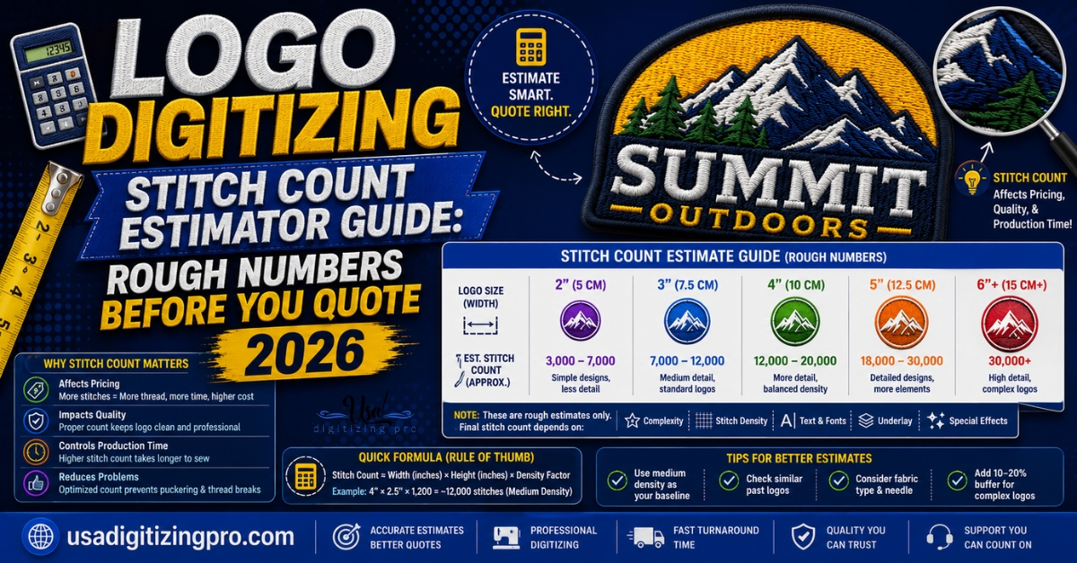
Logo Digitizing Stitch Count Estimator Guide: Rough Numbers.
Stitch count sounds like a technical detail buyers shouldn't have to think about, until a quote comes back higher than expected and.
JPG to Vector Conversion in USA: 2026 Service.
You uploaded your logo to a printer. The proof came back blurry. Or the embroiderer asked for a vector file and you.