

CMYK vs Spot Color Screen Printing: Run Size Guide 2026
Published August 17, 2026 | By USA Digitizing Pro Team
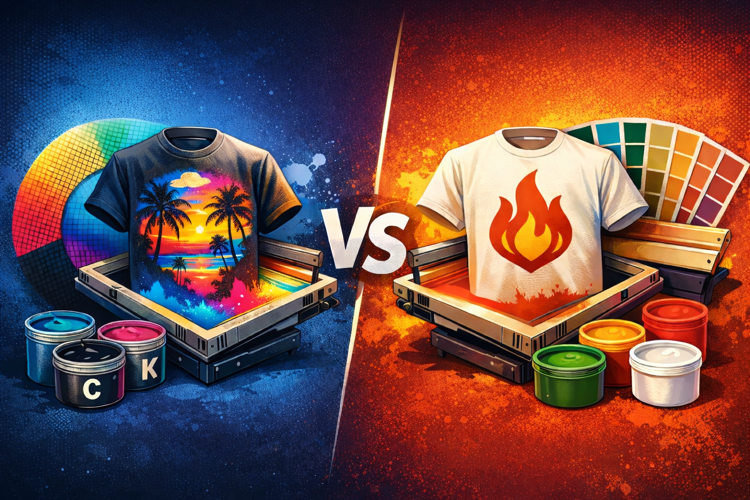
Most guides compare CMYK and spot color screen printing on image quality alone, then leave the buyer to figure out the part that actually decides the job: what it costs to set up and whether the run size justifies it. CMYK vs spot color screen printing is a production economics question as much as a visual one. Screen count, garment color and how many pieces you’re printing all push the decision one way or the other, sometimes overriding what the artwork alone would suggest.
Quick Answer at a Glance
| Question | Answer |
|---|---|
| Which method needs more screens for a simple design? | CMYK, since it uses four base screens regardless of how few colors the design appears to have |
| Which is cheaper for a small run of a two color logo? | Spot color, since two screens beat four on setup cost |
| Which is cheaper for a full color photo print? | CMYK, since spot color would need far more screens to approximate the same range |
| Does garment color change the answer? | Yes, standard CMYK assumes a light base and struggles on dark garments without adjustment |
| At what run size does setup cost stop mattering? | Larger runs spread setup across more pieces, so per piece screen cost drops as volume rises |
| Can I mix both methods on one job? | Yes, through simulated process, which uses set inks with halftone screening |
| What does color separation cost? | Starting at $15 for designs under 5 inches, with larger or more complex work quoted individually |
Why Screen Count Drives the Real Cost Difference
Every screen in a print job carries setup cost: burning it, registering it on press and cleaning it afterward. Spot color uses one screen per flat color, so a two color logo needs two screens. CMYK uses four base screens no matter how simple the design looks. On a short run this gap matters a lot, since setup cost gets divided across fewer pieces. For how each separation file gets built once the method is chosen, the color separation services overview covers the file prep side of both approaches.
How Run Size Shifts the Math
Setup cost is mostly fixed per job, so it hurts most on small runs. Printing 24 shirts with four CMYK screens means the setup for those four screens gets spread across just 24 pieces. Printing 500 shirts with the same four screens spreads that same setup across a far larger order, making the per piece cost of the extra screens close to negligible. This is why a design that looks too expensive for CMYK at small volume can become the obvious choice at production volume.
Why Garment Color Can Override the Artwork Decision
Standard CMYK process assumes a white or very light base, since the inks are semi transparent and rely on the garment showing through to produce accurate color. Print the same CMYK separation on a black shirt and the colors read muddy or disappear entirely. Dark garments usually need either a white underbase screen added, which raises screen count again or a switch to simulated process using opaque inks. Buyers often pick a method based on their artwork and then get surprised when the garment color forces a change.
When Spot Color Wins on a Short Run
A small brand printing 50 shirts with a clean three color logo is almost always better served by spot color. Three screens instead of four, exact brand color matching and crisper flat edges all line up in its favor at that volume. Pushing that same simple logo through CMYK would add a screen, introduce halftone dot texture on what should be flat color and cost more per piece at low quantity.
When CMYK Wins Despite the Screen Count
A photographic design or a graphic with many blended colors flips the comparison entirely. Trying to reproduce that in spot color could take six, eight or more screens, each one a separate flat color approximating part of the image. At that point CMYK’s four screens are the cheaper and better looking option and the halftone blending does something spot color physically cannot.
Side by Side: CMYK vs Spot Color by Job Type
| Job Type | Better Fit | Why |
|---|---|---|
| Two or three color logo, short run | Spot color | Fewer screens, exact color match, lower setup cost |
| Photographic design, any run size | CMYK | Halftone blending reproduces tone spot color can’t |
| Simple logo, very large run | Either, often spot color | Setup cost spreads thin, so color accuracy usually decides |
| Detailed art on dark garments | Simulated process | Opaque inks read correctly where standard CMYK would not |
| Brand critical Pantone match | Spot color | Ink is mixed to the exact reference rather than approximated |
Simulated Process as the Middle Path
Simulated process sits between the two methods and gets overlooked in most comparisons. It uses a chosen set of opaque inks, similar to spot color, but applies halftone screening to extend tonal range, similar to CMYK. On dark garments with detailed artwork it often beats both alternatives outright, since standard CMYK won’t read on the dark base and pure spot color can’t handle the shading.
Questions to Answer Before Choosing a Method
- Count how many pieces are in the run, since setup cost matters far more at low volume.
- Check the garment color, since dark garments often rule out standard CMYK.
- Look at whether the artwork is flat and color defined or continuous tone.
- Confirm whether any brand color needs an exact Pantone match rather than an approximation.
- Ask your separator about simulated process if the job is detailed artwork on a dark garment.
A Real Order, Broken Down
A Texas music venue ordered two shirt designs in the same batch: a flat two color logo for staff shirts, 40 pieces and a full color poster style graphic for merchandise, 300 pieces. The staff logo went spot color, two screens, matched exactly to the venue’s brand colors at a low setup cost spread over a small run.
The merchandise graphic was printed on black shirts, so straight CMYK would have read muddy. It ran as simulated process instead, using opaque inks with halftone screening to hold the artwork’s shading on the dark base. Same batch, same buyer, two different methods chosen by run size and garment color rather than by preference.
Who Builds These Files
USA Digitizing Pro has separated files for spot color, CMYK process and simulated process from its Texas studio since 2015, matching the method to run size, garment color and artwork type. Pricing starts at $15 for designs under 5 inches, with larger or more complex work quoted individually and every order carries a money back quality guarantee.
Frequently Asked Questions
No. CMYK uses four screens regardless of design, so it costs more on a simple two color job, but it costs less than spot color would on a full color photographic design needing many flat color screens.
Setup cost is mostly fixed per job, so extra screens hurt most on small runs. On large runs that same setup spreads across many more pieces, making screen count less of a deciding factor.
CMYK inks are semi transparent and assume a light base showing through. On a dark garment the colors read muddy without a white underbase or a switch to opaque simulated process inks.
A method using a chosen set of opaque inks with halftone screening applied, giving more tonal range than flat spot color while still reading correctly on dark garments where standard CMYK would not.
Not reliably. CMYK approximates colors through halftone dot blending, so a brand critical Pantone reference is generally better served by a mixed spot color ink.
One screen per flat color, so a three color design needs three screens. Adding a white underbase for a dark garment would add one more.
There’s no fixed number, since it depends on the specific setup cost, but the larger the run, the less each additional screen affects per piece cost.
Pricing is based mainly on design size and complexity rather than which method is used, starting at $15 for designs under 5 inches with larger work quoted individually.
Yes, some jobs combine flat spot colors for brand critical elements with process screens for photographic areas, though this raises total screen count.
Run size, garment color and whether any specific brand colors need exact matching, since those three details decide the method more often than the artwork alone does.
Choosing by Run Size, Not Just Artwork
CMYK vs spot color screen printing comes down to more than which one reproduces your image better. Run size decides how much screen count costs you, garment color can rule out standard CMYK entirely and brand critical colors push toward spot ink regardless of everything else. Answering those three questions first usually makes the choice obvious. USA Digitizing Pro separates files for all three approaches.
Follow Us

RELATED BLOGS

5 Ways to Digitize Images for Embroidery, Compared.
Published August 17, 2026 | By USA Digitizing Pro Team There are five realistic routes from an image on your screen to.
Cap Digitizing Underlay Settings Explained: What Holds a.
A cap logo that puckers, sinks, or shifts after stitching almost never fails because of the machine. It fails because the underlay.
1 COMMENT
[…] four is color setup. The artist matches every color to a Pantone code where possible, swaps RGB values to CMYK for print output, and confirms spot colors with the client when the brand has strict palette rules. […]