

The Art of Embroidery Digitizing and Vector Artwork: Where the Two Crafts Conflict (2026)
Published October 3, 2026 | By USA Digitizing Pro Team
The art of embroidery digitizing and vector artwork is usually described as two halves of one process, which makes it sound cooperative. In practice the two disciplines optimize for opposite things. Precision in vector means edges that meet exactly. Precision in embroidery means edges that deliberately do not. A designer who applies vector rules to a stitch file produces a bad stitch file, and a digitizer who applies stitch logic to a vector master corrupts the artwork.
That is the real craft in the pairing. Not doing both, knowing which set of rules applies to which file. This article names six specific points where the two disciplines contradict each other, then covers the mistake that follows from not knowing them.
Quick Answer at a Glance
Here are the six conflicts in one place. Each one gets a section below with the reasoning and the numbers behind it.
| Question | Correct in vector | Correct in embroidery |
|---|---|---|
| Adjacent shapes | Edges meet exactly | Edges overlap and must not exactly meet |
| Node count | Enough to hold the curve | As few as possible |
| Scaling | Infinite, lossless | Locked, roughly 3% on a machine |
| Color | Unlimited, gradients fine | Usually 1 to 6 threads, no gradients |
| Fine detail | Free, costs nothing | Floors apply, below them it cannot exist |
| Geometry | Describes the final shape | Distorted on purpose so the result is right |
Two Crafts, One Piece of Artwork
Before the conflicts make sense, the two file types need separating. They are not two formats of the same thing. They answer different questions.
Vector Describes Shapes
A vector file is a mathematical description of shapes. Paths, nodes, fills, and strokes. Nothing in it knows how the artwork will be produced, which is exactly why it works for print, cutting, signage, and screen printing from one source. The practical details of each container are covered in our breakdown of vector file formats, and the work of getting there from a photograph or a logo scan is raster to vector conversion. Because a vector carries no production assumptions, it stays accurate forever. Scale it to a billboard and the math holds.
Digitizing Instructs a Needle
A stitch file is the opposite kind of object. It is a sequence of needle penetrations with types, directions, densities, and stops, built for one size on one kind of fabric. It knows nothing about shapes in the abstract and everything about this design at this size on this material. The containers it travels in are covered in machine file formats, and what separates a well-built one from a poor one is laid out in our notes on what good stitch construction looks like.
A stitch file is a performance, not a description. That is the root of every conflict below.
Why the Difference Causes Arguments
The friction shows up at hand-off. A designer sends artwork built to vector standards and receives a stitch-out where strokes look slightly heavier, a gradient has vanished, two colors have become one, and the small text is bigger than specified. Nothing has gone wrong. Every one of those changes was required, and none of them is visible in the stitch file as a mistake.
The useful fix is not better communication in the abstract. It is knowing the six specific places where the right answer flips.
The Six Places They Disagree
Each of these is a point where good practice in one craft is bad practice in the other. They come up on almost every logo.
One: Exact Edges Versus Required Overlap
In vector, two adjacent shapes that share a boundary should share it exactly. Any overlap is sloppy and any gap is a defect. In embroidery the reverse is true, and it is defined in the software itself. Pull compensation exists to compensate for thread pulling on fabric by slightly overlapping shapes to eliminate gaps between them.
The reason is physical. Every stitch distorts the fabric, pulling on the sides where the needle penetrates and pushing on the opposite sides. Two color blocks built to meet exactly will separate once sewn, leaving a visible line of fabric between them. Guidance in this area adds a second point worth noting: edge stitches should not exactly meet, because excessive needle penetrations in the same line damage the fabric. A little extra overlap handles a wider range of situations, and too much creates thick lumpy areas and inflates stitch count.
Two: Node Fidelity Versus Node Economy
A vector artist adds nodes until the curve is right. More nodes are not a problem in print, and a complex path costs nothing at output.
Digitizing wants the opposite. Every extra node is another place the stitch path has to change direction, and auto-traced artwork arrives with hundreds or thousands of anchor points where a cleanly drawn capital letter needs a couple of dozen. Path simplification commonly removes 30 to 60 percent of nodes with no visible change to the shape, and that reduction makes the stitch path cleaner. Spotting the difference between a built path and a traced one is covered in digitizing mistakes and their causes.
Three: Infinite Scale Versus a Locked Size
This is the conflict that costs the most money, because the vector habit of free scaling carries over and the stitch file cannot survive it.
Scaling a stitch file does not change the stitch count. Reduce it and the density rises, which can damage fabric and break thread. A running stitch already at 0.5mm has nowhere to go when the design shrinks. Enlarge it and the design sews loose and looks thin, and some stitches can exceed 12.1mm, where many machines automatically insert a trim and leave sections of the design effectively missing.
The published allowances are worth knowing. Many machines let you scale by about twenty percent, which sounds generous and does not adjust stitch count at all. Practical guidance puts safe machine scaling at roughly three percent, with anything beyond that handled in software that recalculates and redistributes the stitches. A different target size is a different file, not a setting.
Four: Unlimited Color Versus a Thread Count
A vector file can carry any number of colors and any gradient. Embroidery cannot. Decorator guidance is direct about it: embroidery is not printing, and color gradients and shading are not practical. Recommended color counts run roughly one to six threads for most designs.
Two workarounds exist and both involve loss. Where a gradient is not central to the artwork it can be dropped, with the natural texture of the stitching standing in for it. Where it matters, two or more thread colors can roughly approximate the transition. Neither works inside small letters, numbers, or small objects, because a gradient needs area to develop. A logo whose identity depends on a gradient needs a flat alternate version for thread, and deciding that in advance beats discovering it on a proof.
Five: Free Detail Versus a Detail Floor
Detail is free in vector. A hairline costs nothing and stays crisp at any size. Embroidery has floors, and below them a detail does not render badly, it cannot exist. Minimum usable line thickness sits around 0.05 inches or 1.27mm, and text needs roughly a quarter inch of height to stay legible. Which stitch can hold a given width is a separate question answered in stitch types and the widths they need and in our guide to choosing a stitch by width.
The practical consequence is that a digitizer will sometimes enlarge an element you specified at a smaller size, or remove one entirely. That is not a liberty. It is the only alternative to stitching something that will read as a blob.
Six: Geometry as Truth Versus Geometry as Compensation
The deepest conflict is philosophical and it has a number attached. In vector, the geometry on screen is the final shape. In digitizing, the geometry on screen is deliberately wrong so that the result is right.
Pull compensation is the clearest case. Software defaults commonly sit around 0.20mm and are often raised to about 0.40mm on most objects. Thicker fabrics usually look better with higher compensation, while thin materials such as satin or twill want a lower value or none at all. So the same logo gets built to different widths depending on the garment, and in every case the shape in the file is slightly fatter than the shape you want on the shirt.
That is the single idea that makes the rest of this article make sense. A digitizer is not drawing your logo. They are drawing what the fabric will turn into your logo.
What the Digitizer Changes That You Must Not Undo
Here is the mistake that follows from everything above, and it is common enough in brand teams to be worth its own section.
The Round-Trip Problem
A designer receives the stitch-out, compares it to the vector, and notices the differences. Strokes slightly heavier. One color gone. Small text larger. The instinct is to reconcile the two, and the wrong way to reconcile them is to edit the vector master to match the stitch file.
Doing that bakes embroidery compensation into artwork that will later be used for print, signage, and screen printing, none of which need it. The heavier strokes that were correct for twill become heavy everywhere. The dropped gradient disappears from the brand. The enlarged text changes the lockup proportions permanently. Six months later nobody remembers why the logo has a slightly odd weight, and the original is gone.
Corrections Flow One Direction Only
The rule is simple and it holds without exception. Changes flow from the vector to the stitch file. They never flow back. If the stitch-out is wrong, the fix belongs in the stitch file or in the digitizing settings. If the design itself is wrong, the fix belongs in the vector and the stitch file gets rebuilt from it. What never happens is the vector being edited to resemble a stitch-out.
What to Change in the Vector Instead
There is a legitimate version of this, and it is worth doing. If digitizing keeps running into the same problem, the vector may genuinely need an embroidery-ready variant. That means a separate file, clearly named, with flattened colors, the gradient resolved into flat areas, and the smallest elements removed or enlarged. The rules for building one are set out in our overview of the two crafts and in vector artwork services.
The key word is separate. A brand with a print master and an embroidery variant has two correct files. A brand with one file that has been edited toward thread has zero.
How the Two Files Should Be Managed
Once the conflicts are clear, file management follows from them almost automatically.
One Vector Master, Several Stitch Files
The vector is the asset. It is production-neutral, it never expires, and every other file is derived from it. Stitch files are derivatives, and because they are size-locked and fabric-specific, a brand running caps, polos, and jackets needs more than one. That is not duplication, it is the correct number. Our overview of the two crafts sets out the relationship in broader terms.
Keep all of them. A stitch file you own can be reordered without paying to rebuild it, and a vector master you own means no supplier holds your brand hostage. Ask for both at delivery and store them together with the size and fabric each stitch file was built for, because a stitch file with no note about its intended size is close to useless a year later.
Hand-Off Checklist
Run this when sending artwork to a digitizer. Each item heads off one of the six conflicts before it becomes a revision.
| Checklist | What to confirm |
|---|---|
| 1. Vector file | Send vector, not a screenshot or a compressed image, whenever you have it. |
| 2. Finished size | State the finished size in inches and the garment or fabric it is going on. |
| 3. Gradient or shading | Flag any gradient or shading and say whether it is essential to the brand. |
| 4. Color count | Count the colors and say which ones may be merged if thread limits require it. |
| 5. Smallest element | Identify the smallest element and its intended height. |
| 6. Detail floor | Say which elements may be removed if they fall below the detail floor, and which may not. |
| 7. Vector paths | Confirm expanded strokes and closed paths rather than live strokes. |
| 8. Stroke weight | Ask whether the stroke weight you see will survive pull compensation on that fabric. |
| 9. Stitch file | Request the stitch file plus a note of the size and fabric it was built for. |
| 10. Vector master | Never edit the vector master to match a stitch-out. |
A Real Order, Broken Down
A Dallas fitness studio sent us a brand package built by a good design agency. The logo was a geometric monogram with two counters inside it, a wordmark beneath, and a thin rule separating them. The vector was clean, the paths were tight, and the file was correct in every way that matters to a printer.
Three things had to change for thread. The thin rule measured 0.03 inches, which is below the line floor, so it either grew or went. The monogram’s inner counters were 0.04 inches at their narrowest, which meant they would fill in and turn the monogram into a solid block. And the wordmark set at 0.19 inches tall, under the quarter inch legibility floor at the 3 inch width they wanted.
We proposed one change rather than three. Width went from 3 inches to 3.6 inches, which lifted the wordmark to 0.23 inches and the counters to just under 0.05 inches. The rule was removed and replaced by spacing, because at any workable thickness it would have competed with the wordmark it was meant to separate. Pull compensation was set for pique knit on the polos and lower for the woven jackets, so two stitch files were delivered from one build.
The agency’s first message asked whether they should update the master file to the 3.6 inch proportions. The answer was no, and that was the most valuable part of the conversation. Their master stayed exactly as it was. What they got instead was an embroidery variant, clearly named, sitting beside the original rather than replacing it.
Who Builds These Files
USA Digitizing Pro has been building embroidery and vector files from a Texas studio since 2015. We do both sides of this, which means we can tell you which of the six conflicts your logo is going to hit before you commit to a size.
Digitizing starts at $15 for designs under 5 inches and $25 for designs above 5 inches, with 2 to 4 hour turnaround and a money-back quality guarantee. See logo digitizing for stitch files and vector work for the artwork side. You keep every file we deliver, and we will tell you the size and fabric each stitch file was built for so it is still usable next year. Reach us at sales@usadigitizingpro.com or +1 (830) 321-7832.
FAQs About Embroidery digitizing and vector artwork
A vector file describes shapes mathematically and carries no production assumptions, which is why it works for print, cutting, and signage from one source. A stitch file is a sequence of needle instructions built for one size on one fabric. The art of embroidery digitizing and vector artwork lies in knowing that the two follow opposite rules, so correct vector practice is often wrong for thread.
Software will produce a file, and it will not produce a good one. Automatic conversion cannot make the judgment calls the six conflicts require: where to overlap, which colors to merge, which details to remove, how much pull compensation this fabric needs, and what the minimum size can be. Those are decisions, not calculations.
Because thread has limits that vector does not. Strokes get slightly wider to survive pull compensation, adjacent colors get overlapped so no fabric shows between them, gradients get flattened because they are not practical in embroidery, and anything below the detail floor gets enlarged or removed. All of those are required rather than optional.
Not properly. Color gradients and shading are not practical in embroidery. Where a gradient is not central to the design it is usually dropped and the natural texture of the stitching stands in for it. Where it matters, two or more thread colors can approximate the transition, and that only works in larger shapes. Small letters and small objects cannot carry a gradient at all.
The Art Is in Knowing Which Rules Apply
Two crafts, one logo, and six places where doing it right in one means doing it wrong in the other. Edges overlap instead of meeting. Nodes get cut instead of added. Size locks instead of scaling. Color collapses instead of expanding. Detail hits a floor instead of being free. And geometry gets distorted on purpose so the finished stitching is accurate.
None of that is compromise. A vector that scales forever and a stitch file that works perfectly at exactly one size are both doing their jobs. The failure only happens when someone applies one craft’s standards to the other craft’s file, which is why the single most useful habit in this whole topic is keeping the two separate and letting corrections travel in one direction.
Follow Us

RELATED BLOGS
Embroidery File Format Guide: Every Format Explained by.
USA Digitizing Pro is a Texas-based embroidery digitizing studio founded in 2015. The team builds machine-ready stitch files across all major formats.
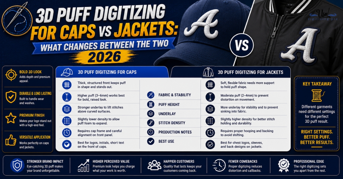
3D Puff Digitizing for Caps vs Jackets: What.
A raised puff logo on a structured cap and the same design on a jacket back look like the same technique from.
1 COMMENT
[…] An extrema is a node at a curve’s horizontal or vertical peak, a definition that comes from font software documentation, where tools exist specifically to create one. Font and type work treats those positions as where nodes belong, and the fact that editors ship a dedicated command for it tells you the tooling expects them there. Beyond that definition we are describing our own working standard rather than citing a rule, and ours is that a path should carry nodes at extrema and at genuine direction changes, and almost nowhere else. The result is the node economy described in our breakdown of which vector format to keep and in how the two file types relate. […]