

The Art Hidden Behind Embroidery Digitizing 2026
Published September 21, 2026 | By USA Digitizing Pro Team
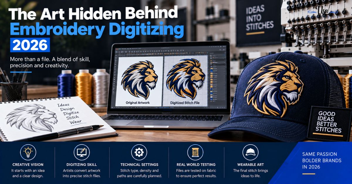
Two stitched logos can both be technically correct and one still looks noticeably better. Same artwork, same thread colors, same fabric, and yet one reads flat while the other has depth to it. The art hidden behind embroidery digitizing is not in the artwork you supplied, it is in decisions made during the translation that have no equivalent in your original file. Most of them come down to a single variable almost nobody thinks about: which way the stitches run.
Quick Answer at a Glance
| Craft Tool | What It Does | Cost to Use It |
|---|---|---|
| Stitch direction | Changes how light reflects off the thread | None, it is a build decision |
| Consistent direction | Produces a smooth polished sheen | None |
| Changed direction | Creates shadow and dimensional illusion | None |
| Direction contrast | Separates adjacent shapes without a color change | None, and it can save a color |
| Layering | Builds physical depth and raised areas | Higher stitch count |
| Texture variation | Suggests material, like fur or foliage | Varies by approach |
Where the Art Hidden Behind Embroidery Digitizing Actually Lives
It helps to be precise about what is meant by art here, because it is not what most people assume when they read the phrase.
Not the Artwork, the Translation
The logo was designed by somebody else, usually long before it reached a digitizer. The creative work in digitizing is not designing anything new. It is deciding how a flat image becomes a physical surface made of thread, where nothing has the properties the original had. Color is finite, edges have thickness, and the surface catches light. what changes when artwork becomes stitches covers the losses in that translation.
Why Two Correct Files Look Different
Both files can have correct density, appropriate underlay, and accurate proportions, and still differ in how they read on the garment. The difference sits in the choices with no right answer: which way each shape runs, whether adjacent areas share a direction or oppose it, and whether the surface is meant to look smooth or textured. Those are aesthetic calls, made deliberately or made by default.
Stitch Direction Is the Brushstroke
If there is one idea worth taking from this article, it is this one. Stitch direction does for embroidery what brushstroke direction does for paint, and it is entirely free to use well.
How Direction Changes What You See
Thread is not matte. Each stitch reflects light along its length, so a shape filled with stitches running one way and the identical shape filled the other way are visibly different tones under the same light. Nothing about the color changed. Only the angle the light bounces off. Tilt the garment and the two areas swap appearance, which is why photographs of embroidery never quite capture it.
Consistent Direction and Sheen
Stitching a shape in one consistent direction produces a smooth, polished surface with a distinct sheen. It reads as deliberate and refined, which is why satin lettering looks the way it does. Consistency is doing the work there. Any wandering in direction across a shape that should look uniform shows up immediately as patchiness.
Changed Direction and Shadow
Changing stitch direction within or between shapes lets the digitizer manipulate light and shadow, which creates a dimensional illusion on a physically flat surface. This is the core technique behind stitched work that looks sculpted rather than printed. It costs nothing in thread or machine time. It costs only the decision. the stitch types overview covers the fill variants that make direction control possible.
Building Depth Without Adding Color
Buyers usually assume depth means more colors, which means more screens of thread, more machine stops, and more cost per piece. Often it does not.
Direction Contrast Between Adjacent Shapes
Two shapes in the same thread color, stitched at opposing angles, read as separate areas with a visible boundary between them. No outline, no second color, no extra thread change. For overlapping forms like leaves, feathers, or layered geometric shapes, direction contrast does the job an outline would have done and looks more natural doing it.
Layering and Raised Elements
Physical depth comes from stacking, whether that means layered stitching that builds height in specific areas or foam beneath the stitches for a genuinely raised effect. This one does cost something, since it adds stitch count and sometimes a production step. It is the difference between suggesting dimension and actually having it. the raised logo technique covers the foam based version of that.
Why This Saves Money Too
Every thread color in a design is a color change on every single garment in the run, and most shops include a limited number before per color charges start. A design that gets its separation from stitch direction instead of from an extra color costs less on every piece. Craft and cost are aligned here rather than opposed. what drives hat embroidery pricing covers where color count sits in a quote.
Texture as a Deliberate Choice
Beyond direction, the surface itself can be smooth or broken, and choosing between them is a design decision rather than a technical default.
Smooth Versus Textured Surfaces
A standard fill produces an even, uniform surface. Varying the fill pattern, the stitch length, or the spacing produces a broken surface that catches light unevenly on purpose. Neither is better. A corporate wordmark wants uniform. A woodland scene on a jacket back does not, and filling it uniformly would flatten everything that made the illustration work.
Matching Texture to Subject
The useful principle is that texture should follow what the shape represents. Fur wants direction that follows the animal’s form and a surface that breaks up. Water wants long flowing direction. Foliage wants variation between adjacent leaves so they separate. A brick wall wants something regular. Applying one fill treatment to all of them is the embroidery equivalent of painting a landscape entirely with one brush.
Where Craft Meets Constraint
None of this happens in isolation. Every aesthetic decision has to survive contact with fabric, and knowing when to stop is as much a part of the craft as knowing what is possible.
The Design Serves the Fabric
A textured fill that looks superb on a stable jacket panel can distort a light knit polo. Layering that builds beautiful depth at eight inches becomes a dense lump at two. The aesthetic decisions get made inside constraints set by the garment and the size, and a digitizer who ignores that produces something that photographs well and wears badly. the bunching diagnostic guide covers what happens when density outruns the fabric.
Restraint Is Part of the Craft
Most commercial logo work does not want visible artistry. A corporate left chest mark should look clean, uniform, and unremarkable in the best sense. Applying decorative texture to it would be a failure of judgment rather than a display of skill. The craft shows up as knowing which jobs call for it and which jobs call for getting out of the way.
What to Ask For If You Want This
Most of these decisions get made by default unless someone raises them, so saying what you want changes what you get.
Request Checklist
- Say whether the design should read uniform and corporate or textured and illustrative.
- Point out any overlapping shapes that need to separate visually.
- Ask whether direction contrast could replace an outline or an extra color.
- Name the elements that should sit forward if the design has depth to it.
- Confirm the garment and size, since both constrain what is possible.
- Request a sew-out, because direction effects cannot be judged on a screen.
A Real Order, Broken Down
A Texas outdoor brand had a crest with overlapping pine trees, originally digitized with every tree in the same green filled at the same angle. Stitched out, the trees merged into one green mass and the shape stopped reading as trees at all. The rebuild changed nothing about the colors. Each tree got its fill angled differently from its neighbors, so light separated them, and the foreground trees were layered slightly over the background ones. Same thread count, same color count, same stitch budget within a few hundred. The design suddenly had depth because the direction was doing work it had not been asked to do before. how build quality shows in the finished stitch covers judging these results on a sample.
Who Builds These Files
USA Digitizing Pro hand digitizes from its Texas studio, choosing stitch direction, texture, and layering deliberately rather than letting the software default them. Pricing starts at $15 for designs under 5 inches, with a 2 to 4 hour turnaround and a money-back quality guarantee. Service details are on the logo embroidery digitizing page.
Frequently Asked Questions
Usually stitch direction. Thread reflects light along the length of each stitch, so identical shapes filled at different angles read as different tones under the same light, even in the same thread color.
Yes. Craft sources describe it as the equivalent of brushstroke direction in painting. Consistent direction produces a smooth sheen, and changing direction manipulates light and shadow to create a dimensional illusion on a flat surface.
Yes, and it is one of the most useful techniques available. Adjacent shapes stitched at opposing angles separate visually with no outline and no second color, which also avoids an extra thread change on every garment.
Direction changes that control where light and shadow fall, plus physical layering where stitching builds height. Foam beneath the stitches produces genuinely raised areas rather than the illusion of them.
No. Corporate wordmarks and clean logo work want uniform fills and should look unremarkable. Texture suits illustrative subjects where the surface is meant to suggest a material.
Texture should follow what the shape represents. Fur wants direction following the form, water wants long flowing direction, foliage wants variation between adjacent leaves so they separate visually.
Direction choices cost nothing, since they are build decisions rather than extra stitching. Layering and raised effects do add stitch count, and stitch count becomes machine time on every garment.
The Decisions You Cannot See
Everything worth noticing about a well-stitched design comes from choices that leave no trace in the original artwork. Which way each shape runs. Whether neighbors agree or oppose. Whether the surface is meant to be smooth or broken. Whether anything sits forward. None of it shows in a file listing, all of it shows on the garment, and most of it costs nothing beyond somebody deciding rather than defaulting.
Follow Us

RELATED BLOGS
Precision Vector Artwork: How to Judge What You.
Published September 21, 2026 | By USA Digitizing Pro Team Someone sends you an AI or EPS file and says the logo.
Custom Embroidery Digitizing Services for Individual Designs: The.
Published October 16, 2026 | By USA Digitizing Pro Team Custom embroidery digitizing services for individual designs are priced the same way.