
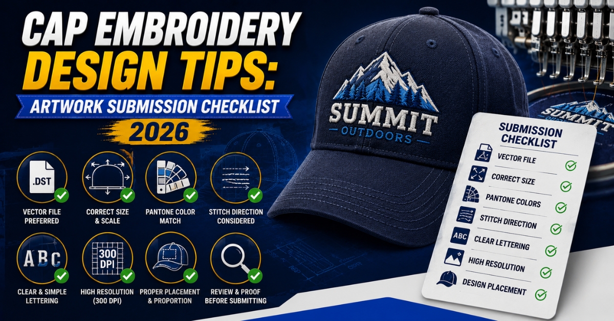
Cap Embroidery Design Tips: Artwork Submission Checklist 2026
Published August 5, 2026 | By USA Digitizing Pro Team
The artwork a brand owner submits before a design ever reaches a digitizer has a real effect on how clean the finished cap looks. Cap embroidery design tips that focus only on what happens during digitizing miss half the picture, since a lot of avoidable problems trace back to the source file itself, not the digitizing process. This checklist covers what to prepare before submitting artwork, so the design a digitizer receives is already set up to translate well into stitches.
Quick Answer at a Glance
| Question | Answer |
|---|---|
| What file type should I submit? | Vector formats like AI or EPS work best; high resolution PNG or JPG can work as a backup |
| How many colors should my cap logo have? | Fewer is better; two to four flat colors digitize most cleanly on caps |
| Can I submit a photo realistic design? | Not directly; it needs simplifying into flat shapes before digitizing |
| What’s the minimum text size I should design at? | Keep lettering large and bold; thin or tiny text often doesn’t stitch out legibly |
| Do gradients work for cap embroidery? | Not well; gradients need to be converted into distinct color blocks first |
| Should I design at the actual cap placement size? | Yes, designing at or near actual size helps catch detail problems early |
| Does better source artwork save money? | Often yes, since less rework is needed if the artwork is submission ready from the start |
Why Source Artwork Quality Matters Before Digitizing Starts
A digitizer can work around a lot, but starting from a clean, well prepped source file means fewer compromises once the design becomes stitches. Cap embroidery design tips that only address digitizing settings skip this earlier step, where decisions about color count, detail level and file format already shape how well the final result will turn out. For what happens once the file reaches the digitizing stage itself, the cap digitizing services overview covers the underlay and settings side of the process.
Choosing the Right File Format to Submit
Vector formats like AI or EPS are the strongest starting point, since they hold clean, scalable paths that translate more predictably into stitch outlines. A high resolution PNG or JPG can work as a backup, but a low resolution or heavily compressed image often loses edge clarity that matters once the design gets converted into individual stitch elements.
Keeping the Color Count Low
A cap logo with two to four flat colors generally digitizes the cleanest and holds up best at the smaller cap placement sizes. Every added color is another separate stitch section and on a small cap placement, too many color transitions packed into a limited space can start looking cluttered or muddy once stitched, even if the original artwork looked fine on screen.
Simplifying Photo Realistic or Gradient Artwork First
A photo realistic image or a design with smooth color gradients doesn’t translate directly into embroidery, since thread can’t blend colors the way ink or pixels can. Before submitting this kind of artwork, it helps to work with a designer or the digitizer to flatten it into distinct color blocks that approximate the original look using solid shapes rather than continuous tone.
Designing Text That Will Actually Read Once Stitched
Thin, delicate fonts or very small lettering are common submission mistakes, since text below a certain physical size just doesn’t hold up once it’s made of individual stitches rather than crisp printed lines. Bold, simple lettering with clear spacing between characters gives a digitizer much more to work with than a thin decorative font squeezed into a small cap placement.
Designing at or Near Actual Placement Size
It’s easy to design a logo large on screen and assume it will scale down fine for a small cap placement. Designing at or close to the actual physical size the logo will be embroidered at helps catch problems, like text that’s too small or detail that’s too fine, before the artwork ever reaches the digitizing stage, rather than discovering the issue after the file comes back.
Side by Side: Submission Ready vs Submission Risky Artwork
| Factor | Submission Ready | Submission Risky |
|---|---|---|
| File format | Vector AI or EPS or high resolution image | Low resolution or heavily compressed image |
| Color count | Two to four flat colors | Many colors or a full photographic palette |
| Detail type | Flat shapes, distinct color blocks | Gradients or photo realistic shading |
| Text style | Bold, simple lettering | Thin decorative fonts or tiny text |
| Design scale | Designed near actual placement size | Designed large and assumed to scale down fine |
A Pre Submission Checklist
- Save or export the artwork as a vector file if possible or a high resolution image as a backup.
- Count your colors and simplify down toward two to four flat colors if the design allows it.
- Flatten any gradients or photo realistic elements into solid color blocks before submitting.
- Check that any text is bold and large enough to hold up at the intended embroidery size.
- Preview or sketch the design at its actual placement size to catch detail problems early.
A Real Order, Broken Down
A new Texas apparel brand submitted a logo with a subtle gradient background and a thin script font for cap embroidery. Before digitizing began, the gradient was flattened into two solid color blocks that approximated the original look and the script font was swapped for a bolder version of the same style at a larger size.
These adjustments happened before the file went into digitizing rather than after a first stitch out came back looking muddy, saving a revision cycle and giving the digitizer a cleaner starting point to work from for the cap placement.
Who Builds These Files
USA Digitizing Pro has worked with brand owners on artwork prep and cap digitizing from its Texas studio since 2015, guiding submissions toward formats and detail levels that translate cleanly into stitches. Every file is backed by a money back quality guarantee.
FAQs
Vector formats like AI or EPS are ideal since they hold clean, scalable paths. A high resolution PNG or JPG can work as a backup if a vector file isn’t available.
Two to four flat colors generally digitize the cleanest, especially at the smaller sizes common for cap placements.
Not directly. A photo needs to be simplified into flat, distinct color blocks before it can translate well into embroidery stitches.
Thin or delicate fonts often don’t hold up once made of individual stitches. Bold, simple lettering generally reads much more clearly at embroidery scale.
Designing at or near the actual placement size helps catch detail and legibility problems before the artwork ever reaches digitizing.
Not well. Gradients need to be converted into distinct solid color blocks first, since thread can’t blend colors the way ink or pixels do.
Often yes, since a well prepped file needs less rework and fewer revision cycles compared to artwork that needs significant simplification first.
Submitting a design with too many colors, fine gradients or tiny text without simplifying it first for the physical limits of embroidery.
Often yes, a digitizer can simplify and adjust artwork during the digitizing process, though starting from cleaner source art generally produces a better result with less back and forth.
Not strictly required, but strongly preferred, since vector files hold cleaner paths than raster images and translate more predictably into stitch outlines.
Prepping Your Artwork Before It Reaches the Digitizer
Cap embroidery design tips that only cover the digitizing stage miss the artwork decisions that happen first. Choosing the right file format, keeping color count low, flattening gradients, using bold text and designing near actual placement size all give a digitizer a cleaner starting point and a better shot at a clean first result. USA Digitizing Pro works with brand owners on both artwork prep and the digitizing itself.

RELATED BLOGS

Left Chest Embroidery Problems: Placement Fixes That Work.
Published August 17, 2026 | By USA Digitizing Pro Team A left chest logo that sits crooked, rides too high or lands.
4 COMMENTS
[…] also includes cap or left chest placement alongside patches, the left chest digitizing service and cap digitizing overview cover the specific file differences for those […]
[…] for the beanies. Same logo, three builds, because three entirely different materials were involved. the cap embroidery design tips guide covers preparing artwork before it reaches this […]
[…] and the primary shape survive, and the tagline, the founding year, and fine internal detail do not. the cap design preparation guide covers simplifying artwork before it reaches the […]
[…] despite being made by different processes. This is a briefing problem as much as a file problem. what to specify when ordering cap files covers the information that needs to travel with the […]