

Color Separation for Screen Printing Beginners Guide 2026
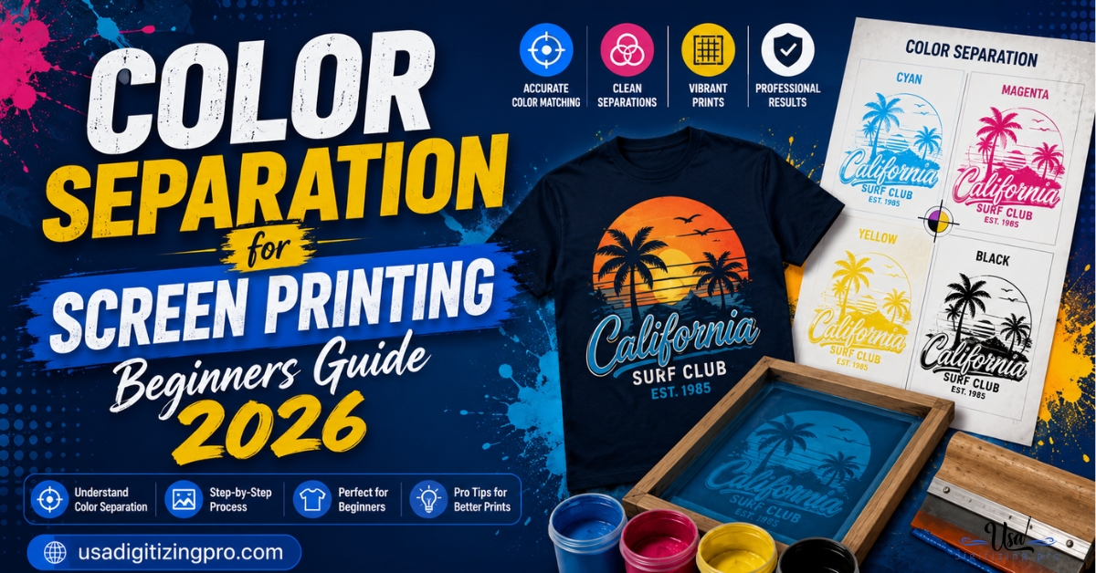
Send a full-color JPG to a screen printer for the first time and you’ll likely hear the same question back, is this separated yet? Color separation for screen printing beginners guide territory starts right there, since a printing press doesn’t understand a photo the way a monitor does. Each ink color needs its own screen, and each screen needs its own clean film. This guide covers what separation actually means, the two main approaches, and how to tell before you order whether your design is a simple job or a complicated one.
Quick Answer at a Glance
What Color Separation Actually Means
Color separation: splitting a design into individual color layers so each one can be printed from its own screen. A screen printing press physically pushes one ink color through one mesh screen at a time. A design with four colors needs four screens, each carrying only the shapes that belong to that specific ink. Skip separation and a printer has no way to know which parts of the artwork belong to which screen.
This is different from how a design looks on a monitor, where millions of colors blend seamlessly. A printed shirt can’t blend ink the way a screen displays pixels. Separation is the translation step between a full-color image and a set of screens a press can actually run.
Spot Color Separation: The Beginner-Friendly Starting Point
Spot color separation is the easiest type to start with, and it’s the right fit for most logos, text, and simple graphics. Each distinct color in the design, a red circle, a black outline, a blue fill, becomes its own layer with a single flat color and no shading. Every color gets matched to a Pantone (PMS) reference or a custom-mixed ink so the color stays consistent from one print run to the next. Vector artwork makes this process far cleaner than raster, since each color boundary is a precise path rather than a blurred pixel edge. For background on why vector files matter here, the JPG to vector conversion walkthrough covers what changes when artwork moves from pixels to paths.
Process Color Separation: When Photos and Gradients Are Involved
Process color separation, built around CMYK or simulated process techniques, exists for designs spot color can’t handle: photographs, gradients, and blended shading. Instead of flat color layers, process separation builds a small set of screens (commonly cyan, magenta, yellow, and black, or a simulated variant using specialty inks) that combine through halftone dots to recreate a full range of tones. It’s a more technical process than spot color and generally costs more to set up, but it’s the only route for photo-realistic or heavily shaded artwork.
Why Beginners Should Start with Fewer Colors
Every added color in a spot-color job means another screen, another registration point to align, and more room for something to shift during the print run. Limiting an early design to four colors or fewer keeps setup manageable and keeps the per-piece cost down. This isn’t a hard rule forever, just a sensible starting point while you’re still learning how separation and registration interact on a real press.
How Vector Artwork Changes the Separation Process
A raster image (JPG, PNG) stores color as a grid of pixels with soft, anti-aliased edges between colors. Trying to separate that directly produces fuzzy color boundaries and stray pixels bleeding between what should be two distinct screens. Vector artwork stores each shape as a clean mathematical path, so a color separator can isolate exactly where one ink stops and another begins without guessing at a blurry edge. This is why most separation services ask for vector files upfront rather than working from a photo or screenshot.
What Happens If You Skip Separation and Send a Photo Instead
Here’s the gap most beginner guides don’t spell out clearly. Sending a plain JPG logo to a screen printer doesn’t stop the job, but it does add a hidden step and cost most buyers don’t anticipate. The printer, or a separation service on their behalf, first has to trace or rebuild the artwork into clean color layers before separation can even start. That rebuilding step is essentially a vector conversion done under time pressure, and it’s where unexpected charges and delays usually creep into a first-time order.
Spot Color vs Process Color: Quick Comparison
Preparing Your First Design for Separation
- Keep the color count at four or fewer for your first project.
- Submit vector artwork (AI, EPS, PDF, or SVG) rather than a JPG or screenshot whenever possible.
- Avoid gradients and photo elements unless you’re ready for process color separation and its added cost.
- Name or note the intended ink colors if you have specific Pantone matches in mind.
- Confirm the print location and garment color, since dark garments sometimes need an underbase layer that adds a screen.
A Real Order, Broken Down
A new streetwear brand in Nashville submitted a five-color logo for their first print run, built as a flattened JPG exported from a design mockup. The colors bled into each other at the edges once opened at print resolution, since the JPG’s compression had softened every boundary between shapes.
The file went through vector reconstruction first, tracing each color region into a clean path before separation could start. Once rebuilt, the five colors separated cleanly into five spot screens, each matched to a specific PMS reference the brand approved before printing began. The brand’s second order, submitted as a vector file from the start, skipped the reconstruction step entirely and moved straight to separation, cutting turnaround by more than half.
Who Handles This Work
USA Digitizing Pro has produced color separation and vector artwork for screen printers and apparel brands from its Texas studio since 2015. Every separation is built by hand, matched to actual ink or thread colors rather than approximated automatically. The team backs its work with a money-back quality guarantee.
Frequently Asked Questions
Spot color uses one solid, flat color per screen, ideal for logos and text with no shading. Process color builds a full tonal range from a small set of screens using halftone dots, which is necessary for photos and gradients that spot color can’t reproduce.
Most shops run presses with 6 to 12 screen stations, so the practical limit depends on the specific press rather than the printing method itself. Simulated process jobs commonly use 6 to 8 screens to recreate a photo-realistic look.
It’s strongly preferred. Vector files give clean, precise color boundaries that separate accurately. A raster file can work for simpler designs, but anything with fine detail or multiple colors benefits significantly from starting as vector artwork.
An underbase is a white or light ink layer printed first on dark garments so the design’s true colors show through clearly rather than being muted by the fabric color underneath. It adds one additional screen to the separation but is usually necessary for accurate color on dark shirts.
Basic separation for simple spot-color designs can be done in standard vector software like Illustrator or CorelDraw by assigning each shape its own color layer. Process color separation for photos generally requires specialized plugins or professional separation software to get clean halftone results.
Pricing scales with color count and complexity. A simple two or three color spot job costs far less to separate than a seven-color simulated process job built from a photograph. Getting an exact quote requires sending the actual artwork for review.
Screen colors are RGB light values, while printed ink is a physical pigment matched to Pantone or CMYK references. The two systems don’t map perfectly, which is why a proof print or approved color swatch matters more than trusting the monitor display.
Reducing the number of distinct colors in the artwork is the most direct lever, since fewer colors means fewer screens and less registration setup. A design with 8 colors can sometimes be simplified to 4 or 5 without a noticeable visual difference at normal viewing distance.
Yes. Screen printing separation assigns ink colors to physical screens. Embroidery uses thread colors assigned during digitizing rather than screens, and the process for building a stitch file is entirely different from separating artwork for print.
Not accurately. A photo has continuous tonal variation that spot color’s flat layers can’t reproduce. Process color separation, using halftone dots across several screens, is the only reliable way to reproduce photographic detail in screen printing.
Color separation for screen printing beginners comes down to picking the right approach, spot color for solid designs, process color for photos, starting with vector artwork, and keeping the color count manageable while you learn how registration and screens interact. USA Digitizing Pro handles both spot and process color separation by hand for shops and brands across the USA, backed by a money-back quality guarantee.
Follow Us

RELATED BLOGS

Modern Hat Machine Embroidery: Methods and File Rules.
Published September 21, 2026 | By USA Digitizing Pro Team Modern hat machine embroidery no longer means one thing. A cap that.

Types of Color Separations for Screen Printing: Complete.
Published August 17, 2026 | By USA Digitizing Pro Team Six distinct separation methods cover essentially every screen printing job and most.