

Threading Stories Into Fabric: Handwriting Into Stitches 2026
Published September 21, 2026 | By USA Digitizing Pro Team
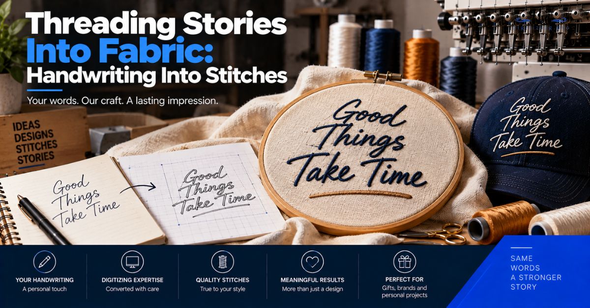
Most embroidery digitizing is company logos headed for uniforms. A smaller and quieter category is personal: a signature, a line from a letter, a recipe card in someone’s handwriting, stitched onto something that will be kept. Threading stories into fabric is the same technical process applied to very different artwork, and it comes with constraints worth knowing before you scan anything. Here is what happens to handwriting on the way to becoming stitches.
Quick Answer at a Glance
| Question | Answer |
|---|---|
| What do you need to start? | A clear scan of the handwriting, ideally not a photo |
| Can any handwriting be digitized? | Most can, though very faint or very fine strokes are harder |
| Does it look exactly like the original? | Close, with stroke widths standardized and fine wobble smoothed |
| How long can the text be? | Shorter is better, since long text fails in small hoops |
| Do you see it before it is finalized? | A draft is standard practice before the file is finished |
| What items suit this? | Pillows, handkerchiefs, garments, quilts, blankets, bags |
| What does digitizing cost? | Starting at $15 for designs under 5 inches |
What Threading Stories Into Fabric Actually Involves
The mechanics are the same as any digitizing job. What changes is that the artwork was never designed to be reproduced, and that changes several decisions.
Handwriting Is Artwork Like Any Other
A signature gets treated exactly like a logo: the shapes are identified, a stitch type is assigned, density and underlay are set for the fabric, and a stitch file comes out the other end. Nothing about the process is special. The difference is entirely in the source material and in what matters about preserving it. what a digitizer decides while building a file covers the underlying sequence.
Why It Is Harder Than a Logo
A logo was drawn with reproduction in mind, usually with consistent stroke weights and deliberate spacing. Handwriting was not. Strokes vary in thickness from the pressure of the pen, letters connect inconsistently, and the whole thing may sit at a slight angle on the page. All of that has to be interpreted rather than traced, and the interpretation is where the work is.
Capturing the Original
Everything downstream depends on this step, and it is the one most people rush. A good capture makes the difference between a faithful result and an approximation.
Scanning Beats Photographing
A flatbed scan at high resolution gives even lighting, no perspective distortion, and clean contrast between ink and paper. That is exactly what a digitizer needs to identify where each stroke begins and ends. Most home printers scan, and a library or copy shop will do it if yours does not. It is worth the trip.
If You Can Only Photograph It
Sometimes the original is in a book, on a card that cannot be flattened, or somewhere it cannot be taken from. In that case, photograph it in bright even daylight, hold the camera directly above and parallel to the page rather than at an angle, and fill the frame with the writing. Avoid flash, which creates hotspots and shadows along the pen strokes.
What Cannot Be Recovered
Be realistic about faded ink, writing that has bled through from the other side of thin paper, and pencil that has smudged. A digitizer can interpret a lot, and what is genuinely illegible in the source stays illegible. If there are multiple examples of the same handwriting available, sending two or three helps, because the clearer one can inform how the harder one is read. why source quality sets the ceiling covers the same principle on logo artwork.
What Happens to the Handwriting in Digitizing
Three decisions get made that change the handwriting slightly, and knowing about them in advance prevents the sense that something was lost.
Stroke Width Is the First Decision
Pen pressure makes real handwriting thicker in some places and thinner in others, sometimes dramatically. Thread cannot go below a physical minimum width, so the thinnest parts get thickened to something that will hold as stitches. The result reads as the same handwriting with slightly more even weight. the minimum stitch width thresholds covers where those floors sit.
Where Letters Connect or Break
Cursive writing connects letters, and sometimes those connections are barely there on the page. The digitizer decides which connections to keep as continuous stitching and which to treat as separate shapes. Keeping every faint connection can produce fragile hairlines. Breaking too many makes the writing look printed rather than written. It is a judgment call, and a draft is where you confirm it went the way you wanted.
What Gets Preserved and What Gets Smoothed
The characteristic shapes survive: the slant, the loops, the way a particular person crosses a letter or ends a word. Very fine tremor and paper texture do not, because thread cannot render them and attempting to would look like a defect rather than authenticity. The aim is the handwriting recognizably being that person’s, not a facsimile of one specific pen stroke.
Size and Length Limits
This is the constraint that disappoints people most often, and it is easy to plan around once you know it exists.
Why Long Text Fails in Small Hoops
Fitting more words into a fixed width means each letter gets smaller, and below a certain size letters stop being legible in thread regardless of how well they were built. Marketplace services commonly cap names at around nine letters before charging more, and note directly that long names do not work well in small hoops. The limit is physical rather than commercial.
Matching Length to the Item
A signature on a handkerchief corner, a first name on a pillow, or a short phrase across a quilt block all work comfortably. A full paragraph from a letter usually does not, unless the item is large enough to give each line real height. If the text matters more than the item, choose the item to suit the text rather than the other way around. how size limits detail in embroidery covers the same thresholds in commercial work.
Common Keepsake Projects
Three project types account for most personal handwriting work, and each brings its own fabric considerations.
Memory Pillows and Garments
Pillows made from someone’s clothing are among the most common uses. The fabric is whatever the garment was, often a knit or a soft woven that has been worn thin, which means backing choice matters more than usual and density should stay modest. Tell the digitizer what the fabric actually is rather than what the item is. why backing choice decides the outcome covers stabilizer selection by fabric.
Handkerchiefs and Wedding Pieces
Handkerchief corners, a swatch sewn inside a dress or jacket, and similar small pieces are popular for weddings and remembrance. The fabric is usually fine and light, which suits a light touch: modest density, a short piece of text, and careful backing so the finished piece stays soft rather than stiffening.
Quilts and Blankets
Signature quilts have a long history, with family members or community members each contributing a name. Modern versions often digitize the signatures so they can be stitched consistently. Blanket and quilt fabrics vary enormously, so the same signature may need slightly different treatment depending on which block it lands on.
Ordering One
The process is short, and supplying the right things at the start removes almost all of the back and forth.
Order Checklist
- Scan the handwriting at high resolution rather than photographing it if at all possible.
- Send more than one example if you have them, especially if any are faint.
- State the finished size in inches and the item it is going onto.
- Name the actual fabric, particularly if the item is old or worn.
- Say which parts matter most if the writing has to be shortened.
- Ask to see the draft before the file is finalized, which is standard practice.
A Real Order, Broken Down
A Texas family wanted their father’s signature stitched onto pillows made from his shirts, one for each of four siblings. They photographed the signature from a greeting card at an angle, and the perspective made one letter ambiguous. A flat scan of a second card resolved it. In digitizing, the very light upstroke on the final letter was thickened so it would hold, and two faint cursive connections were kept as continuous stitching because breaking them would have made the signature look printed. Density was set low for shirting that had been worn soft, with cutaway backing so the pillows would not pucker. The draft was approved before the file was finalized, and all four pillows ran from the same file. what to send when ordering digitizing covers the equivalent brief for commercial work.
Who Builds These Files
USA Digitizing Pro digitizes handwriting and signatures alongside commercial logo work, from its Texas studio since 2015, with density and backing guidance matched to the specific item. Pricing starts at $15 for designs under 5 inches, with a 2 to 4 hour turnaround and a money-back quality guarantee. Service details are on the logo embroidery digitizing page, and single color artwork work is covered on the silhouette art page.
Frequently Asked Questions
A clear digital copy of the handwriting, ideally a high resolution flatbed scan rather than a photo, along with the finished size, the item, and the actual fabric it is going onto.
Yes, though a scan is much better. If you must photograph, use bright even daylight, hold the camera directly above and parallel to the page, fill the frame, and avoid flash.
Close, with two deliberate changes. The thinnest strokes get thickened so they hold as stitches, and very fine tremor is smoothed. The characteristic slant, loops, and letterforms are preserved.
Shorter is better. Marketplace services commonly cap names around nine letters before charging more and note that long names do not work well in small hoops, since fitting more words means smaller letters.
Sometimes. A digitizer can interpret a great deal, though what is genuinely illegible in the source stays illegible. Sending two or three examples helps, because a clearer one can inform how a harder one is read.
Yes, showing a draft before finalizing the file is standard practice, and it is the point at which to confirm the letter connections and stroke weights look right to you.
Memory pillows made from clothing, handkerchiefs, garment swatches, quilts, blankets, and bags are all common. The item mainly determines the available size and the fabric considerations.
One Scan Is Usually Enough
Threading stories into fabric is less complicated than it sounds. Scan the handwriting properly, keep the text short enough for the item, tell the digitizer what the fabric actually is, and check the draft before the file is finalized. The technical constraints are real and easy to plan around, and the part that matters, the handwriting still looking like that person’s handwriting- survives all of them.
Follow Us

RELATED BLOGS
Embroidery File Format Guide: Every Format Explained by.
USA Digitizing Pro is a Texas-based embroidery digitizing studio founded in 2015. The team builds machine-ready stitch files across all major formats.

The Evolution of Embroidery Design and Why It.
Published September 21, 2026 | By USA Digitizing Pro Team Ask why embroidery files are called punched, why the format your machine.
1 COMMENT
[…] A child’s drawing from the year they were six. A parent’s handwriting from a recipe card. A signature. A sketch somebody made who is no longer here to make another. None of that exists as a stock design and none of it ever will. This is the case where a one-off is obviously worth the setup, and it is covered more closely in our piece on turning handwriting and keepsakes into stitches. […]