

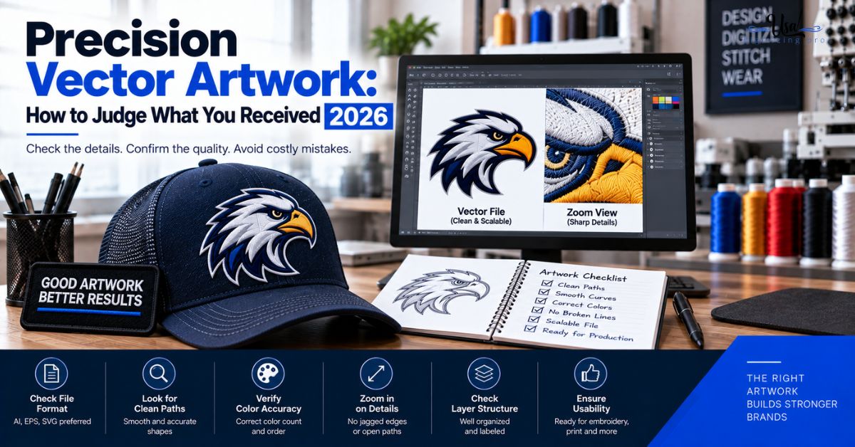
Precision Vector Artwork: How to Judge What You Received 2026
Published September 21, 2026 | By USA Digitizing Pro Team
Someone sends you an AI or EPS file and says the logo is now vector. That tells you the file format and nothing about whether the artwork inside it is usable. Precision vector artwork is defined by the quality of its paths, not by its extension, and a file auto-traced in thirty seconds carries the same extension as one drawn properly over an hour. Here are the tells that separate them, and what each one costs you further down the line.
Quick Answer at a Glance
| Tell | What You See | What It Means |
|---|---|---|
| Excessive anchor points | Hundreds of nodes on a simple shape | Traced from pixel edges, not drawn |
| Wobbly straight edges | Micro-bumps along what should be flat | The tracer followed image noise |
| Gaps or overlaps | Hairline slivers where shapes meet | Shapes generated separately, not built |
| Text as odd outlines | Letters with lumpy or uneven strokes | Type outlined from a raster, not set |
| Thin lines filled in | Outlines that became solid shapes | The tracer misread a stroke as an area |
| Clean result | A simple letter on a couple dozen nodes | Drawn or properly cleaned up |
Why Precision Vector Artwork Is Not Just About Being Vector
The word vector describes how the file stores shapes. It says nothing about how well those shapes were built, and that distinction is where most disappointment comes from.
A File Can Be Vector and Still Be Bad
Any raster image can be run through an automatic tracer and saved as a vector file in seconds. The output is genuinely vector, in that it stores paths rather than pixels. Those paths just happen to follow every speck of noise along the original image’s edges. The file scales without pixelating and still produces poor results everywhere it gets used. the raster to vector conversion walkthrough covers what proper conversion actually involves.
What Precision Actually Means Here
A well built vector uses the fewest anchor points necessary to describe each shape, with curves that are smooth and edges that are where the design intended them to be. The goal is the minimum points that capture the form. That is not an aesthetic preference, it is what makes the file editable, predictable in production, and light enough to work with.
The Five Tells of an Auto-Traced File
These are checkable rather than subjective. Any one of them on its own can be explained away. Two or more together mean the file was traced and never cleaned up.
Tell One: Anchor Point Count
This is the clearest signal. A cleanly built letter, something like a capital S, needs roughly a couple dozen anchor points. A trace of the same letter pulled from a noisy image can carry hundreds, sometimes thousands, packed into tiny wobbling curves that follow the grain of the original picture. If a simple shape shows nodes everywhere when you select it, the file was traced.
Tell Two: Wobbly Curves on Straight Edges
Zoom in on an edge that should be perfectly straight or a curve that should be perfectly smooth. Auto-tracers hug the raster edge closely, so any compression artifact or anti-aliasing in the source becomes a real bump in the path. On screen at normal size it looks fine. At four hundred percent zoom the edge visibly ripples.
Tell Three: Gaps and Overlaps Between Shapes
Where two colored areas meet in a properly built file, they share a clean boundary. In traced output you often find hairline gaps showing the background through, or shapes overlapping each other by a fraction. Both cause problems later, because a screen printer separating colors or a digitizer following edges has to decide what the boundary was supposed to be.
Tell Four: Text Converted to Awkward Outlines
Type in a traced file was never type. It was letter shapes pulled out of a picture of letters, so the strokes come out uneven, the curves lose their consistency, and the spacing drifts slightly from what the typeface intended. Set properly and converted to outlines, letters stay even. Traced from an image, they look subtly wrong in a way people notice without being able to name.
Tell Five: Thin Lines Turned Into Fills
Automatic tracers frequently misread a thin outline as a narrow filled shape, or lose small details entirely. The visual difference can be slight, and the consequence is not: a stroke can be adjusted in thickness later while a filled sliver cannot, and anything the tracer dropped is simply gone. the settings behind common digitizing faults covers how thin elements behave once they reach stitching.
How to Run the Inspection
You do not need to be a designer to check most of this. Two of the tells need software and the rest need nothing but zoom.
What You Can Check Without Design Software
Open the file in any viewer that renders vector, or ask for a PDF export, then zoom in hard. Four hundred percent or more. Look along edges that should be straight for rippling, look where two colors meet for hairline gaps, and look at the letterforms for uneven strokes. Three of the five tells show up this way with no tools at all.
What Needs the File Opened
Anchor point count and whether strokes became fills both need the file open in vector software. If you do not have any, ask whoever supplied the file to select a single shape and send you a screenshot with the anchor points visible. A provider who built the file properly will do that without hesitation. Reluctance to show you the paths is itself informative.
What Bad Paths Cost Downstream
None of this matters in the abstract. It matters because every process that uses the file has to work with whatever the paths actually say.
In Embroidery Digitizing
A digitizer builds stitch boundaries by following the artwork’s paths. Excessive anchor points and wobbling edges mean the digitizer is either working around noise or manually cleaning the file before starting, both of which add time. Industry sources note directly that excess anchor points make digitizing harder and increase production time. Gaps between shapes force the digitizer to guess where the real boundary was. what a digitizer decides at the workstation covers why clean boundaries matter at that stage.
In Screen Printing and Signage
Color separation works from closed clean paths, so gaps and overlaps become registration problems on press. On signage and large format, every wobble in a path is reproduced at final size, which means an edge that rippled invisibly on screen ripples visibly on a storefront. what each production method needs from a vector master covers the requirements by process.
When Auto-Tracing Is Genuinely Fine
Auto-tracing is a tool rather than a failure, and treating it as always wrong is inaccurate. It has a range where it performs well.
Artwork That Traces Cleanly
Solid flat colors, sharp defined lines, basic geometric shapes, and high resolution sources all trace well because there is little edge noise for the tracer to follow. A crisp black and white logo at high resolution can trace close to perfectly. The trouble starts with textured sources, photographs, gradients, low resolution images, and anything with fine detail.
Cleaning Up a Trace
A trace can also be cleaned rather than discarded. Path simplification reduces node count substantially without visible quality loss, and US tutorials commonly cite reductions in the range of thirty to sixty percent on typical traced output. That is a real workflow, and it is what separates a competent conversion using automatic tools from raw tracer output shipped as finished work.
Getting a File Rebuilt Properly
If the inspection turns up two or more tells, the file needs rebuilding rather than patching. That is a smaller job than most people expect.
Request Checklist
- Ask for the file to be rebuilt as clean paths rather than retraced.
- Specify that text should be set properly, not outlined from an image.
- Ask for strokes to stay as strokes where the original design had outlines.
- Request the layered master plus the export formats your vendors need.
- Ask for documented color references at the same time.
- Request a zoomed screenshot with anchor points visible on delivery.
A Real Order, Broken Down
A Texas equipment dealer sent what they had been told was a vector logo to be digitized for work shirts. It was an EPS, so nothing looked wrong. Opened in vector software, a single letterform in the wordmark carried several hundred anchor points, the circular badge outline rippled visibly at high zoom, and a thin keyline around the badge had been traced as a filled ring rather than a stroke. Digitizing from it would have meant either reproducing the ripples in thread or cleaning the file first. Rebuilding the logo as clean paths took less time than cleaning the trace would have, and the resulting file went on to serve their signage and print work too. building one master file for every application covers what to keep once a clean master exists.
Who Builds These Files
USA Digitizing Pro rebuilds artwork as clean vector paths from its Texas studio rather than running it through automatic tracing, keeping anchor points minimal and strokes intact. Pricing starts at $15 for designs under 5 inches, with larger or more complex work quoted individually and a money-back quality guarantee. Service details are on the vector artwork page.
Frequently Asked Questions
Zoom in hard and look for rippling along edges that should be straight, hairline gaps where colors meet, and uneven letterforms. Then check anchor point count, since a simple shape carrying hundreds of nodes was traced rather than drawn.
As few as necessary to describe the form. A cleanly built capital letter needs roughly a couple dozen. Hundreds or thousands on a simple shape indicates the path is following pixel noise from the source image.
Yes, technically. It stores paths rather than pixels and scales without pixelating. The paths just follow the noise in the original image, which causes problems in every process that reads them.
They make the file harder to edit, produce wobbling edges instead of clean ones, and industry sources note that they make digitizing harder and increase production time.
On solid flat colors, sharp defined lines, basic shapes, and high resolution sources. It struggles with textures, photographs, gradients, low-resolution images, and fine detail.
Sometimes. Path simplification can cut node count substantially, with US tutorials commonly citing reductions around thirty to sixty percent without visible quality loss. Files with dropped detail or strokes converted to fills usually need rebuilding.
Automatic tracers often misread a thin stroke as a narrow filled area. The visual difference is slight and the consequence is not, since a stroke can have its thickness adjusted later while a filled sliver cannot.
Check the Paths, Not the Extension
Precision vector artwork is a property of the paths inside the file, and the file extension tells you nothing about them. Zoom in on the edges, look where colors meet, check the letterforms, and count the nodes on one simple shape. Five minutes of inspection catches a file that would otherwise cost you time at the digitizer, registration problems on press, and rippled edges on a sign nobody can unsee.
Follow Us

RELATED BLOGS

Applique Digitizing Stitch Count Reduction: Techniques That Work.
Published August 17, 2026 | By USA Digitizing Pro Team Switching a large design from full embroidery to applique cuts stitch count.
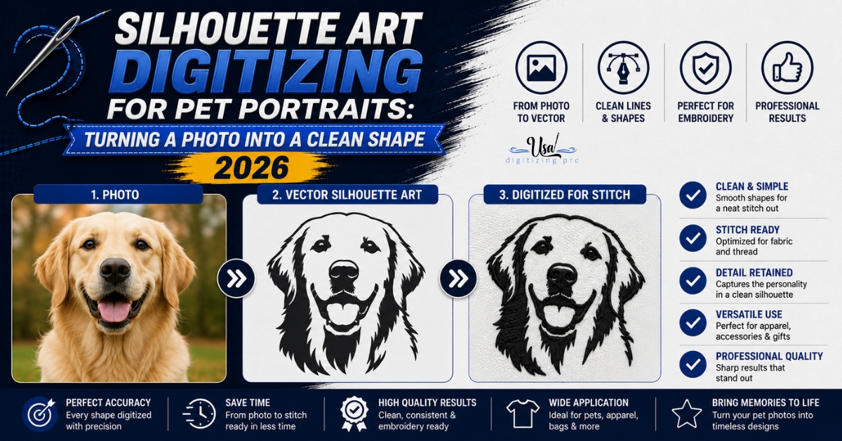
Silhouette Art Digitizing for Pet Portraits: Turning a.
A pet photo has fur texture, shadow, and a busy background. A silhouette has none of that on purpose. Silhouette art digitizing.